Understanding Giorgio MorandiNotes on Formal Analysis
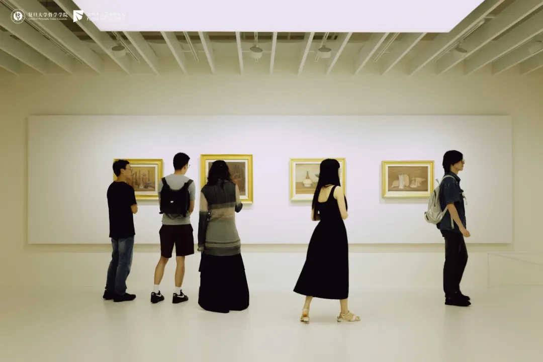
The “Phenomenology · Art” summer school, hosted by the Department of Philosophy of Art at Fudan University, gave me the chance to visit the much-talked-about exhibition “Giorgio Morandi: Monologue” at the Museum of Art Pudong, and it changed my impression and understanding of Morandi outright. Time was limited, and toward the end my energy and my brain were simply worn out, so I skipped many of the later works (the large group of flower paintings at the end, for instance, and the late landscapes). What follows organizes some of the details I noticed during the visit, painting by painting, in the order of the exhibition route. Quite a lot of paintings are involved.
What I offer here is mainly a formal analysis of the paintings themselves. The photos are all shots I took of the works; their color accuracy is far below that of the originals, and they certainly cannot stand in for them. Nor can any single point in the analysis stand in for the experience of looking at the originals. If you have the chance, I recommend going to see the exhibition at the Museum of Art Pudong.
Something else that interested me a great deal was the frames of Morandi's paintings in the show. Almost no two frames in the exhibition were alike, and every one of them was exquisite in the extreme. You could only admire them.
September 3, 2026, photo by Hong Xiaoyu
September 3, 2026, photo by Qiu Tong
Figures
1.
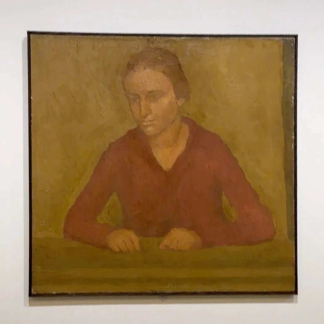
V.n.70, oil on canvas. Private collection
The first work to catch my attention when I entered the gallery. The woman's two hands rest on the edge of the table and her arms spread out to either side, so that her whole upper body forms a very low, broad triangle; her head is like a block of form rising slowly out of this triangle. The whole painting relies almost entirely on faint differences in value to keep one object separate from another. Around 1920 Morandi had just come through his phase of metaphysical painting, and so the works of this period begin to use brighter, more opaque paint. The characteristics of Morandi's metaphysical painting will come out a bit more clearly in several paintings further along in the exhibition.
2.

V.n.93, oil on canvas. Uffizi Galleries, Florence
The 1924 Self-Portrait is one of Morandi's very few self-portraits, and it is, moreover, the kind of self-portrait that shows the painter in the act of painting. He sits very upright, his face turned almost directly toward us. What is rather interesting is that, unlike most self-portraits, his eyes are not the visual center of the painting. I went up especially close to look, and his eye sockets come near to a kind of emptiness; you can detect no gaze in them at all. The visual center of this painting is instead the white sleeve, the dark vest, the palette, and the vertical structure of the body.
Structured Landscapes
3.
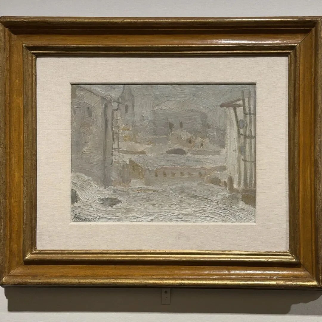
P.2016, 1910/1, oil on canvas. Art and History Collections of the Fondazione Cassa di Risparmio in Bologna
With this painting Morandi really began to interest me. It is earlier than any of the paintings in the first section—1910. It belongs to the earliest group of Morandi's works now known. At a glance the painting has a lingering Impressionist flavor, and its composition also brings to mind The Embarkation of the Queen of Sheba. The two share the same compositional structure: depth is created by vertical buildings running parallel to the short sides of the canvas. The buildings on the left and right are like two wings of a stage set, pinching the line of sight between them, so that the road in the middle recedes inward, and in the distance you can see houses and a bell tower.
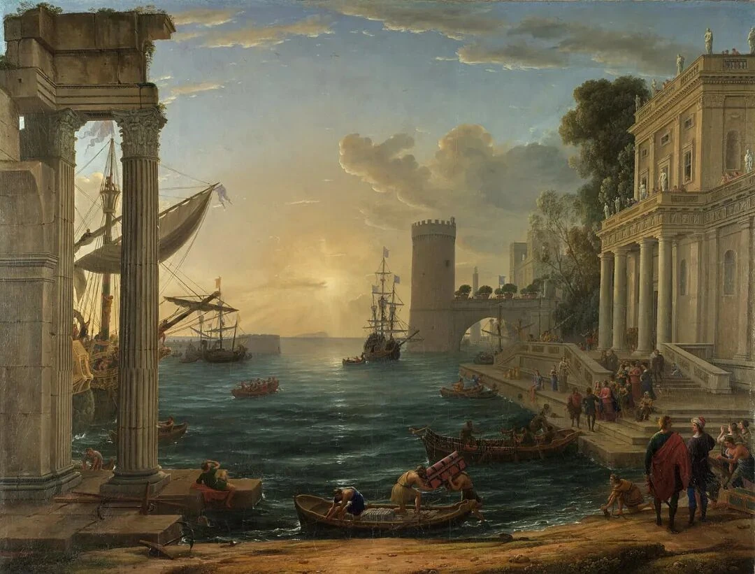
Oil on canvas. National Gallery, London
The most interesting thing in this painting is the snow in the foreground. The paint of the snow is not smooth, and the sense of its standing up off the surface is extremely strong; the area is full of short horizontal strokes. But as you look into the “depth” of the picture, the paint describing the buildings there gets thinner and thinner, fainter and fainter. So the near-and-far relations in this painting come, on the one hand, from perspective, of course, and on the other from the thickness and visibility of the paint itself. Judging from certain techniques in Morandi's later paintings, something was already beginning to show here: space does not rest entirely on geometric perspective, but on tonal relations and on the density of the painted surface.
The year 1910 is special in another way, too: Morandi was only twenty. That year he had been to Florence and seen the paintings of Giotto, Uccello, and others, and he had also already come into contact with the French modern painting of Paul Cézanne and others. So Snowy Landscape actually occupies a very particular position: on the one hand, Morandi is still showing the legacy of late-nineteenth-century landscape painting; on the other, he has begun to make contact with the foundational elements of modernist painting. This shows up especially clearly in the next painting.
4.
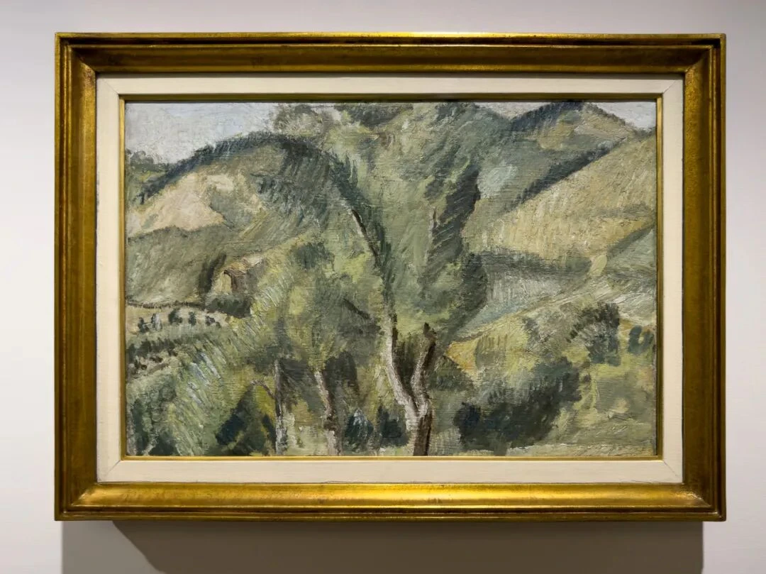
V.n.11, oil on canvas. Museo del Novecento, Milan
This painting is more interesting still. Almost everyone there could see that it bears a strong Cézannean influence, because here Morandi had learned Cézanne's signature parallel brushstrokes. But if that were all there was to it, it wouldn't be Morandi.
The spatial skeleton of this painting is, beyond doubt, the tree in the middle. It connects the foreground with the hills behind, and the short, thick, juxtaposed strokes around it, along with the patches of mostly green and ochre, really do call to mind a quite explicitly Cézannean structure (Pines and Rocks, say). But what is rather interesting is that when you look up close and attend to the slanting planes on either side of the central trunk, you find that the slopes have not been treated as continuous natural terrain at all; they are more like slanted planes, block after block, straining against one another. Every part of the picture tilts in a different direction, and the central trunk has the job of gathering up and unifying these opposing directions. On the spot I tried stepping back and moving in to look at the painting: from a distance it is a mountain landscape; up close, the definiteness of the “mountain” gradually disappears, and little by little we can notice only the slanting patches of ochre, green, and gray and the strokes that keep changing direction; step back again, and they congeal once more into tree and mountain. This back-and-forth experiment is something any viewer can try in front of Morandi's paintings.
So, for painting, when is an object an “object”? And when does it become a heap of paint and patches of color?
I think this is Cézanne's real influence on Morandi. Cézanne is far more than the surface “parallel brushstroke.” The more important point is this: the world we see is not an already finished three-dimensional space, and the painter's work is not as simple as copying that space onto a two-dimensional canvas. Painting has to re-establish the order among objects on the plane. Merleau-Ponty gives a brilliant account of this in “Cézanne's Doubt.” After seeing the exhibition I found that you could say Morandi spent his whole life doing just this, and that he, like Cézanne, never once allowed his painting to become thoroughly abstract. The late Morandi pressed Cézanne's relatively overt structure further and further out of sight.
Look at the central tree in this painting. Following the logic of naturalism, we would expect distinct branches and leaves and a clear crown, yet Morandi did not take the trouble to depict the leaves. Here the crown and the slopes begin to pass into each other, and the green of the tree keeps mixing with the green of the background. The really stable part of the tree is instead the few trunks; they are the vertical coordinate system of a horizontal painting. This quality of mutual interpenetration, and objects that serve as the picture's structure, will both come up again and again in Morandi's later paintings.
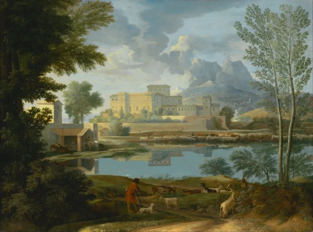
97.PA.60, oil on canvas. J. Paul Getty Museum, Los Angeles
Beyond this, there is something not so easy to notice: this painting has, astonishingly, almost no sky in any real sense. The so-called “sky” is nothing more than a very narrow gap along the upper edge. This makes the slopes keep pressing forward toward us, so much so that they seem about to topple over. So the expansiveness of nineteenth-century and earlier landscape painting (Poussin's landscapes, for example), the kind that can pierce the surface of the canvas and reach depth and clarity, is all but wiped out here. The space still barely has some depth, but it has begun to flatten.
5.
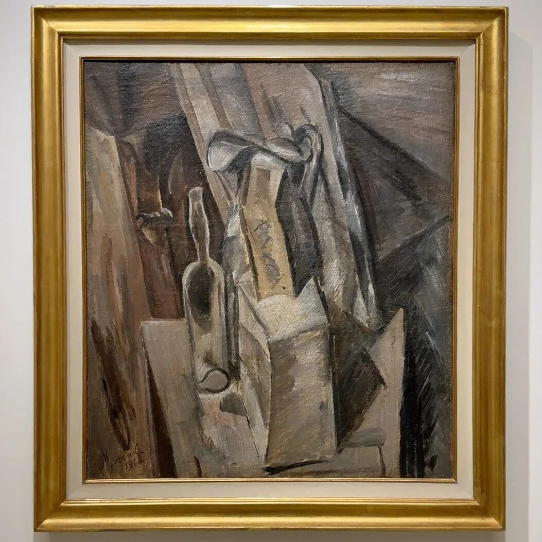
V.n.13, oil on canvas. Collection of Augusto and Francesca Giovanardi, Milan
1914 was a turning point for Morandi. The Cubism section is something of an odd one out in the whole exhibition. In the picture, the jug in the middle (or is it a jar?) rises up, there is a bottle on the left, and around them are various boxlike forms, but they are not resting on a level tabletop—the whole picture is sliced by a set of diagonal planes, the left side tilting up, the right side pressing down. Given the high viewpoint and these tilted planes, Morandi is indeed very close to the Cubism of the time. But the point is that Morandi still differs from typical Analytic Cubism. Braque or Picasso, in their paintings of this period, were far more radical than Morandi in this respect: they would often take objects completely apart, treating object and background with one and the same visual vocabulary. But Morandi's objects here still keep a sense of being recognizable “things”; we can still roughly make out what they “are.” This matters, because Morandi never really gave up the substantiality of things. However abstract the still lifes of his maturity became, a bottle was still something with weight, something that occupied real space.
Another element in this painting is very interesting: the diagonal. Diagonals all but vanish from Morandi's later paintings. In this picture nearly everything is moving on a slant. Only, by the 1930s, although Morandi's pictures seem to have nothing left in them but verticals and horizontals, this tension of the tilted has not gone away; it has simply moved from obvious slanting to the differences produced by gaps of a few millimeters and by extremely subtle overlaps.
6.
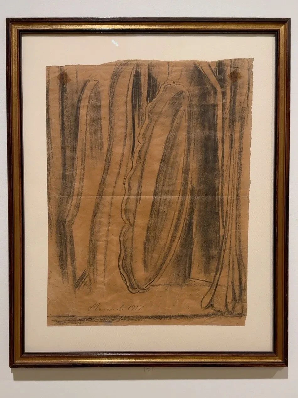
T.P.1915/3, charcoal on paper. Private collection, Bologna
In the gallery this one was hung diagonally across from the painting above. I think the two are well worth looking at back and forth. There are many vertical forms here, stretched to the extreme. The bottles no longer look like bottles; they look more like a set of columns and arcs. The curved contour in the middle is especially strange; I really can't see what everyday object would have such proportions. At the bottom of the sheet there is a very thin horizontal line, and everything above it stretches upward, so the picture produces a very obvious vertical tension.
You can see here that Morandi at the time was indeed fascinated by the “interpenetration” of the boundaries of objects. The objects have no complete contours of their own; the borders between bottle and background, and between one bottle and another, often overlap or seep into each other. As a drawing, this one is arguably not even up to standard; much of it is unclear and muddled. But as a study of space its clarity is remarkable: when several “masses” occupy the same space, how is a rhythm among them to be built? The intervals between these verticals are interesting, because at this point Morandi had not yet entered his maturity, and in the second half of the exhibition his use of such intervals becomes extremely restrained. That restraint can bring about enormous changes in spatial relations, as will become clearer later on.
The Metaphysical Period
7.
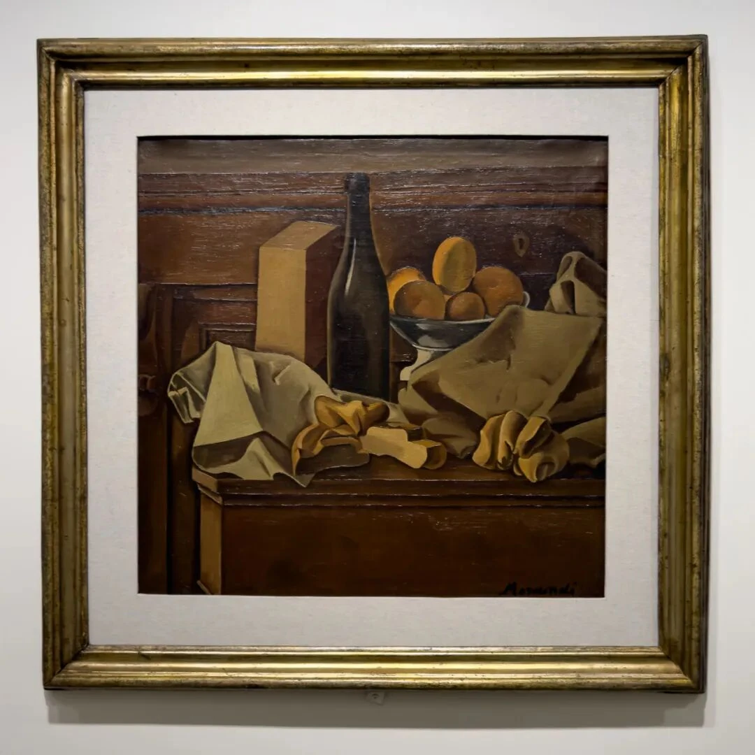
V.n.47, oil on canvas. Eni Collection
This is a very typical work from Morandi's metaphysical period. It can be compared with the 1914 Cubist still life above. In the 1914 painting everything is moving on the diagonal, whereas the momentum here has become extremely congealed. Above all the black bottle in the middle: it is the anchor of the painting, locking the whole space in place at a stroke.
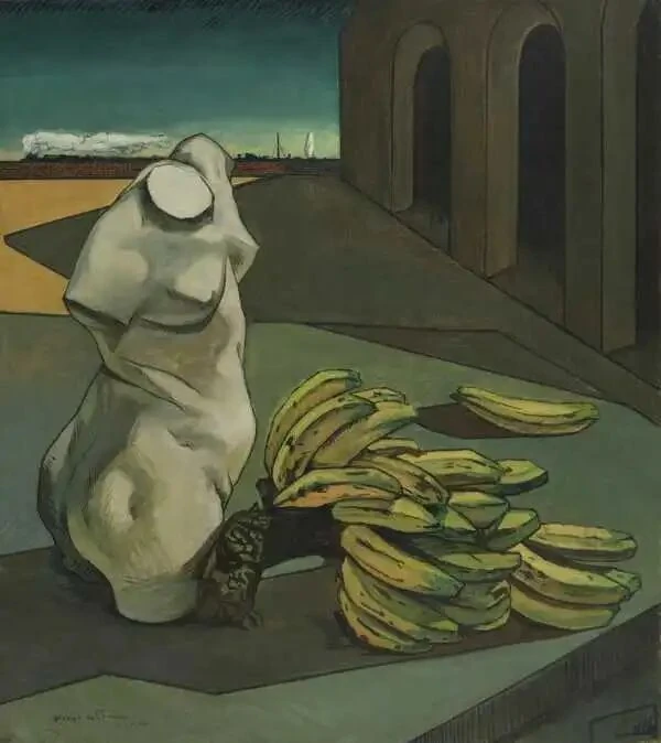
I looked at this painting for a long time, and the longer I looked, the eerier it seemed. And this eeriness is entirely different from what de Chirico's paintings, the classic metaphysical school, give you. De Chirico's paintings make you feel something more like the mystery of dreams and omens, but this painting gives a very unusual sense of artificiality. Take the bowl of fruit (oranges?) in the upper right: of course they're round, but there would be nothing wrong with seeing them as colored versions of the standard plaster spheres and ellipsoids you find in a studio. What is the rectangular column on the left? It has nothing of daily life about it whatsoever; it is simply a pure brown prism. The cloth in front and the glove-like, bread-like things have strong folds and volume, yet it is just very hard to be sure what they “are.” The most ordinary objects, once cut loose from their habitual uses, suddenly show a strangeness that is hard to explain.
T04109, oil on canvas. Tate Modern, London
The black bottle in the middle is particularly interesting. As an object, it is of course a “black bottle,” but if we consider its structural function in the painting—think of the tree in the 1913 Landscape—we find that on its left is a prism so clean as to be nearly abstract, and on its right a complicated mass of cloth and fruit. So the whole painting, with the bottle as its dividing line, shows a very strict symmetry: everything on the left tends toward the geometric, the hard, and the vertical; everything on the right tends toward the organic, the soft, and the curved. The two clumps of folds in the foreground, together with the bottle, join the split left and right halves back together. You could even say the painting is essentially an arrangement of rectangular solids, spheres, cylinders, and draped-cloth forms. This is plastic value. In this sense, even Morandi in his metaphysical period was probably still not far from the spirit of Cézanne.
Bread and Lemon
8.
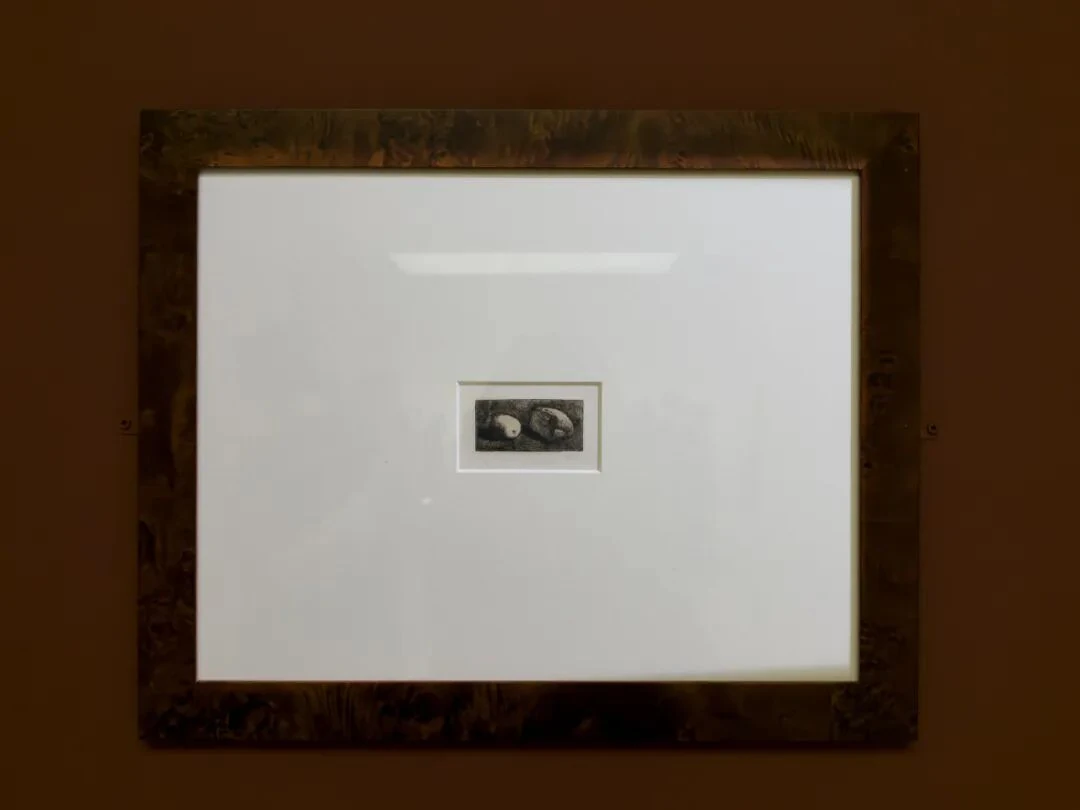
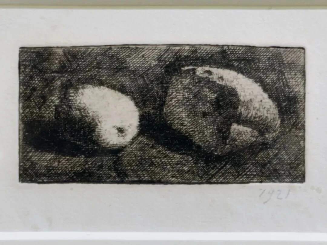
V.Inc.n.13, etching on copper
This picture is just too interesting: an extremely small work, but one that rewards looking enormously. The curators gave it an entire large wall. The brighter, oval thing on the left is the lemon, and the thing on the right is the cut bread. What is rather interesting is this: if we didn't look at the title, could we recognize the bread and the lemon at a glance? In my own case, at least, the thought didn't cross my mind at all in the first instant of seeing the picture.
You can see from this work that Morandi had already begun working hard to get away from the habit of describing objects with “lines.” That is to say, the importance of contour clearly declines here. Look carefully at the upper edge of the lemon on the left: it is not cut out from the background by the usual closed line used to delineate contours. The lemon can be told apart from the background because the lines inside it are relatively sparse while the lines of the surrounding background are extremely dense. So a brighter “mass” emerges from the dark.
Even more interesting is the black area between the lemon and the bread. The lemon and the bread don't touch; between them is a very narrow, very dark gap. Morandi used a great deal of cross-hatching, making this gap the place with the heaviest visual weight in the whole picture. So the gap, far from being “empty,” may actually be the densest place in the picture. The same goes for the area below and to the left of the lemon, and below the bread. That is to say, in this etching negative space begins to have the same plastic standing as the objects themselves.
At the same time, because the work is so extremely small, if we stand back we can probably see only a small black rectangle in the middle with a pale mass on either side. Only when you come close can you discover how complicated this black gap is.
You can also try thinking about the light-dark relations of the picture. The denser the lines, the darker the area, and vice versa. So look at the black hole in the cut face of the bread; it does three things at once: first, it tells us this is the cut face of the bread; second, it creates an interior space (it is a “black hole”); third, it pushes the lit crust around it forward. The lemon is just the opposite: its surface is almost entirely overexposed, with only a few short lines hinting that this is a curved surface. In other words, Morandi here translates tone into density of hatching. And from this you can see that even in a picture with no color at all, Morandi is still completely Morandi. For the essence of “Morandi colors” lies not in pairing a few low-saturation hues, but in the relations between objects—relations of value, of overlap, of density, of interval, of adjacency.
Boundaries are not absolute. The Morandi who realized this had already begun to enter his maturity. The lemon emerges from the place where the background hatching gradually thins out; so does the bread. The difference between object and environment is nothing more than a difference in density within one and the same field of lines.
We usually assume that there has to be an “object” first before the “background” can mean anything. But Morandi does almost the reverse: the object is just the result of a temporary congealing within a continuous visual field; the closer you get, the less recognizable the object becomes, until in the end there is nothing left but changes in the density of the hatching; and when you step back, the objects (the lemon and the bread) appear again.
Fresh Flowers
9.
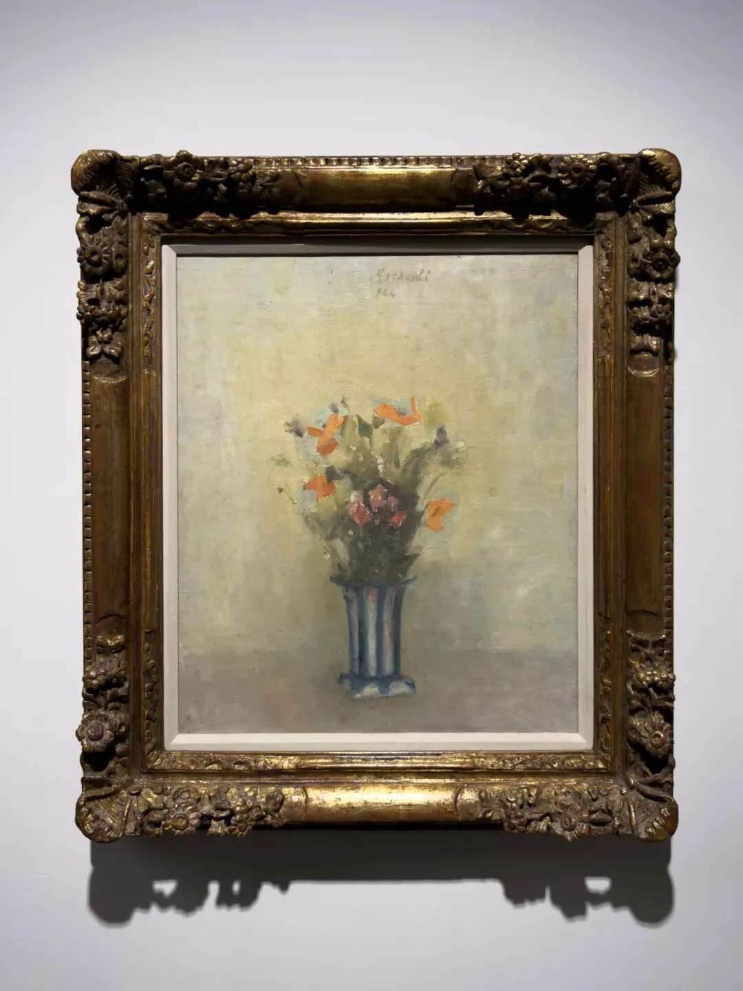
V.n.90, oil on canvas. Summit Trust, Geneva, Sidarta Collection
“Flowers” are another important thread running through this Morandi exhibition. There is a heavyweight flower painting later on, too. Start with the flowers at the top. The red-orange petals have very noticeably raised paint; you can tell Morandi painted very fast, practically a single sweep of the brush leaving these marks, with no definite edges at all. The flowers are blurred, swift. The vase below is the complete opposite. The vase is vertical; blue-gray vertical stripes cut its body into several clear bands, and its base stands firmly on the tabletop. And so a tension appears within the picture: the flowers in the upper half are expansive, scattered, trembling, blurry, rapid, while the vase in the lower half is stable, contained, even somewhat architectural. If we wanted to, we could even say that the two parts belong to two different times: one the changing time of something that blooms for a moment and is gone, the other an almost eternal time.
Besides this, if you look carefully you can see that the vase is not seen from a strictly frontal viewpoint. We can see a little of the side at the base of the vase. So although the picture is highly centered, it still keeps a subtle turn. Morandi often uses this very slight degree of offset to put tension into what would otherwise be a very stable structure.
Now look at the background. There is no “wall” behind the vase in any real sense. The line between tablecloth and wall is also very indistinct. The background is almost one single expanse of pale gray, milky white, and light yellow seeping into one another. The farther out the stems and leaves of the flowers go, the blurrier they get, until we can't tell whether certain spots are leaves or just a patch of paint on the canvas.
The darkest clump in the center deserves special attention: the weight of the bouquet lies not in the red petals but in the dense green-brown patch just above the mouth of the vase. All the stems and leaves tangle together there, forming a dark area, and then a few red-orange petals suddenly leap out of it.
Yellow Drapery
10.
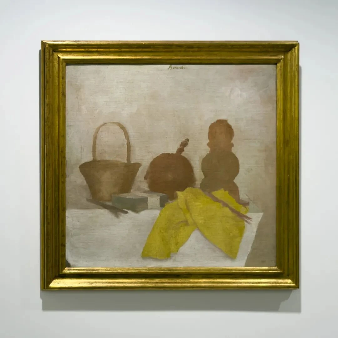
V.n.101, oil on canvas. Fondazione di Studi di Storia dell'Arte Roberto Longhi, Florence
From here on we are finally, slowly, entering the Morandi we all know. The first thing that caught my attention was the cloth in the foreground. Notice that the objects in the back row all tend toward the vertical and have a very definite geometric quality, while the yellow cloth droops forward off the tabletop, forming several sharp, irregular triangles, and so cuts through the stable vertical and horizontal structure of the picture.
That is to say, it plays an almost anti-geometric role here.
But oddly, Morandi did not use the traditional fine, fussy folds to convey the material quality of the cloth; instead he painted it quite roughly: the cloth is folded into a few rather large planes, like corrugated cardboard. You can still see the influence of Cézanne and of Cubism here, that is, the habit of understanding objects first of all as “masses” and “vectors” occupying the picture.
11.
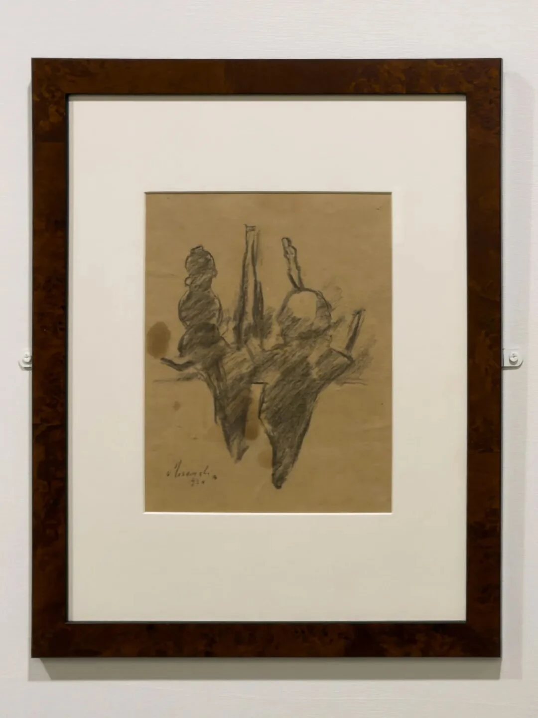
T.P.1924/2, pencil on paper. Museo Morandi, Bologna
Look at this one alongside the last, because once the color is taken away we suddenly find that the composition of this work is surprisingly strict. The arch of the basket, the round object in the middle, the gourd-shaped contour of the tall bottle, the right angles of the box, the diagonals of the cloth in the foreground—together they form almost a specimen sheet of different geometric types. Morandi's drawings shouldn't be read as preliminary sketches for the oils; I think the most interesting thing about his drawings is watching how he arranges spatial relations.
12.
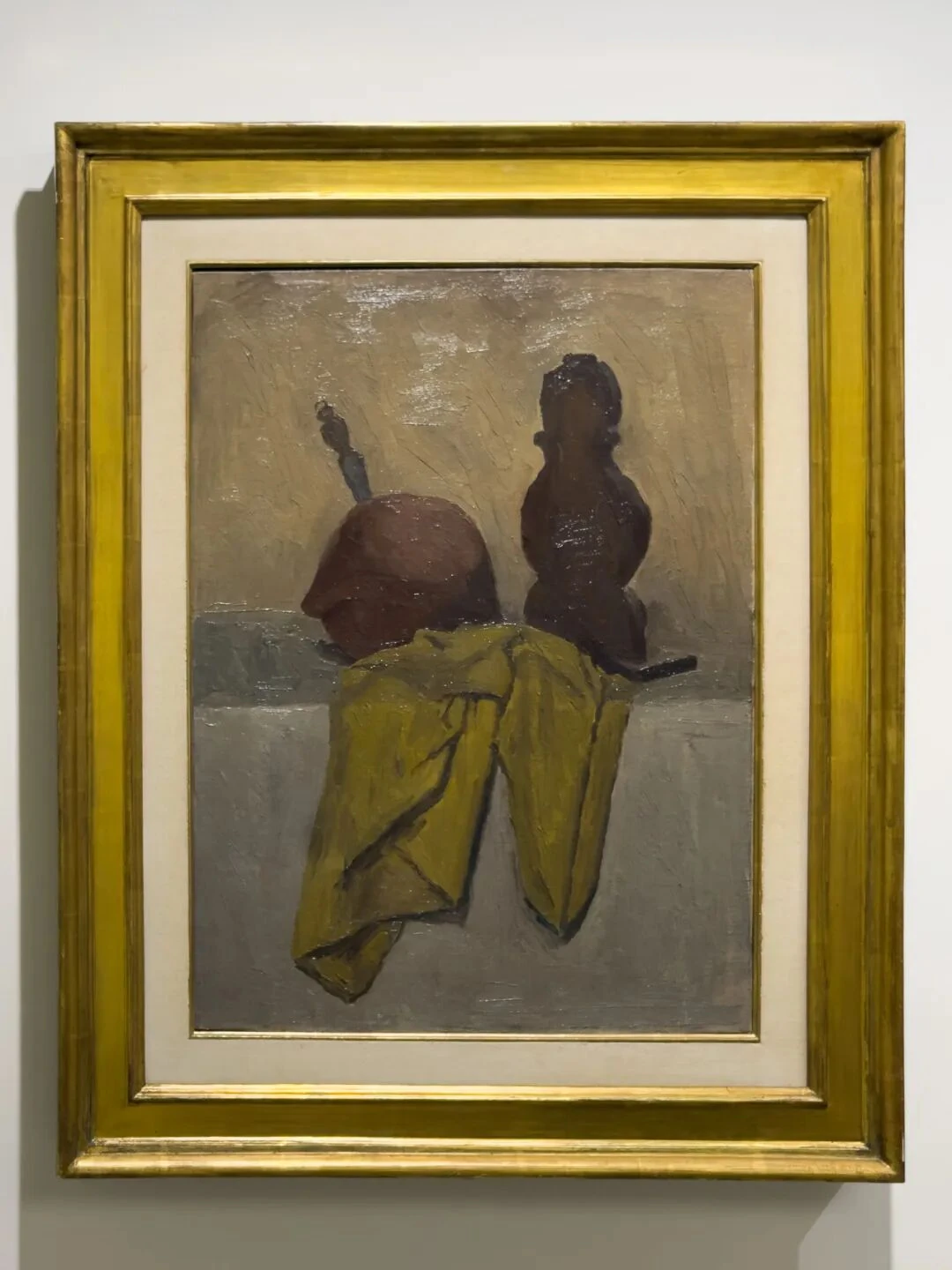
V.n.127, oil on canvas. Collection of Augusto and Francesca Giovanardi, Milan
This one hangs in a group with the two just discussed. And here it gets even more interesting. Four years later, Morandi has taken away many of the things in the complicated arrangement of 1924. The basket is gone, the box has basically disappeared, and what remains is mainly the round object at the back, the tall bottle to its right, and the yellow tablecloth. This reduction suddenly makes very vivid a structure that was already present in the 1924 painting but obscured: two vertical dark bodies at the back provide visual weight and steadiness, and the yellow cloth pours down in front of them. The cloth is bigger than before, occupying nearly the whole lower half of the picture, and the objects behind have become dark brown silhouettes. So the whole painting is compressed into three “masses”: a round dark thing at the back left, an upright dark thing at the back right, and in front a large folded plane of yellow ochre.
One more rather interesting thing: if you compare it with the 1924 painting, you find that the lighting here has changed a great deal. Four years earlier, the boundaries of objects were still soft, seeping into the background, but that is not at all the case in this painting.
Grizzana
13.
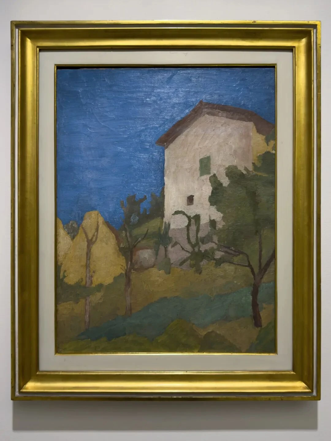
V.n.125, oil on canvas. Italian Chamber of Deputies, Rome
The sky is so interesting—you might even say so “strange.” From the start of the exhibition up to this point, this is the first time Morandi has given us such a large area of saturated blue. More interesting still, we might ask ourselves: is this blue really “the sky”? Taken by itself, it is probably closer to an enormous blue plane. The house in front, the yellow slope, and the trees are basically stuck onto this blue like cutouts. Especially the house. The front of the house is one large pinkish-gray polygon, the roof another brown slanted plane, and the windows just two tiny patches of color.
I think the house also has something of the still life about it: treat it as a bottle in one of Morandi's still lifes, and everything seems to fall into place—a clear vertical axis, a closed body, a small opening (the windows), a definite visual center, and everything around it organized in relation to it.
The sense of space in this painting is shallow. The mountains, too, have become almost like two geometric blocks set upright, especially the one on the right, which is cut through the middle by a tree—in effect placing mountain and tree within one and the same figural relation.
14.
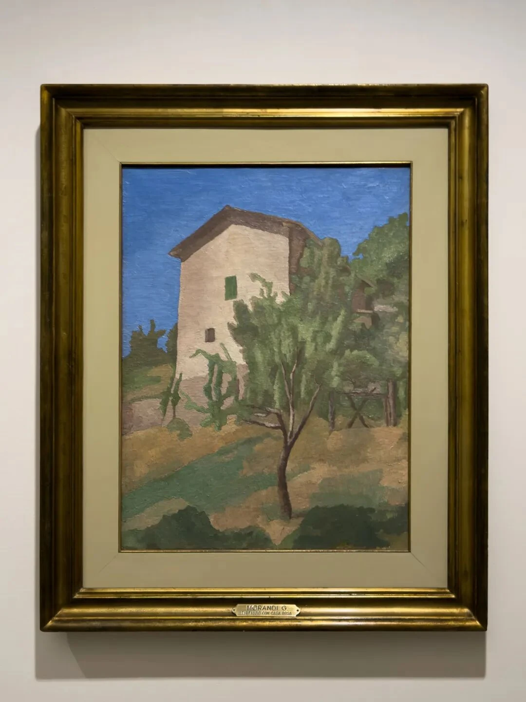
V.n.135, oil on canvas. Collection of Augusto and Francesca Giovanardi, Milan
This should be looked at together with the previous one. The biggest change is the addition, in the foreground, of a tree with an extremely strong presence. The tree blocks out the lower half of the house. In the previous painting the house was the core of the composition, but now it and the tree form a double structure, one laid over the other, front to back.
“Overlap”—this is another of Morandi's motifs. Overlap itself becomes the source of depth. The sense of space comes from the relations of covering between planes. In the “Variations” section later on this is brought out to the full, because there Morandi will show us how finely changes in these covering relations can be calibrated.
15.
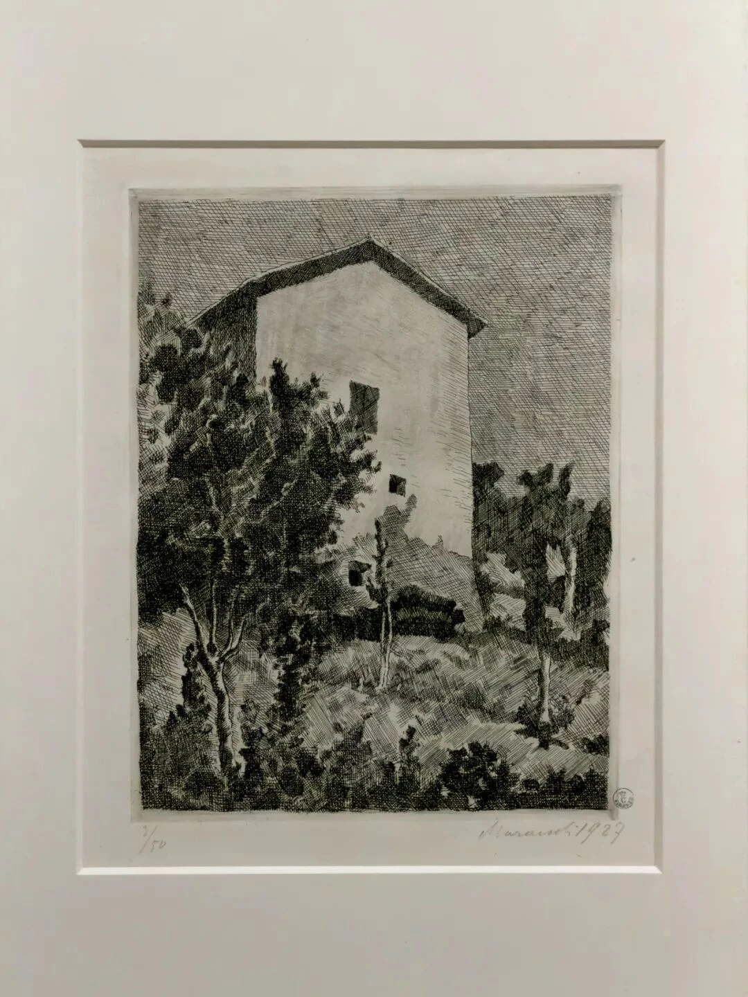
V.Inc.n.32, etching on zinc. Uffizi Galleries, Florence
After the two house paintings, look at this etching. Once all the color is gone, the house suddenly becomes the brightest place in the whole picture. Why? Think of Bread and Lemon: it is because he etched fewer lines there. The method that had already matured there turns up again here. The house is not a white object; the house is the region of lowest density in the whole field of lines.
Now look at the sky. By ordinary experience the sky ought to be the brightest part, but Morandi has etched it as a large, dense grid, and the walls of the house have become the brightest places instead. That is to say, he has almost entirely freed himself from the rule of representational convention and simply redistributes the density of lines according to the light-dark structure this picture needs.
Look at the three house pictures together and you find that Morandi's “landscapes” no longer depend much on the viewing position that a person, in the landscape tradition, naturally takes up in front of nature. That is, the feeling of “gazing out into the distance”—and gazing out produces the kind of depth in Poussin's paintings, along with the sublime, or the pastoral, the picturesque.
Go back to the 1928 one: if you imagine the house as a large pale bottle, the tree in the foreground as a long, thin dark bottle, the trees on the right as a flattened cluster of bottles, and the yellow-green ground below as the tabletop, doesn't it feel perfectly natural and very “Morandi”? When we get to his still lifes later, you can also think the other way around: what happens if you look at these still lifes as architecture?
Complexity, Simplification, and Disturbance
16.
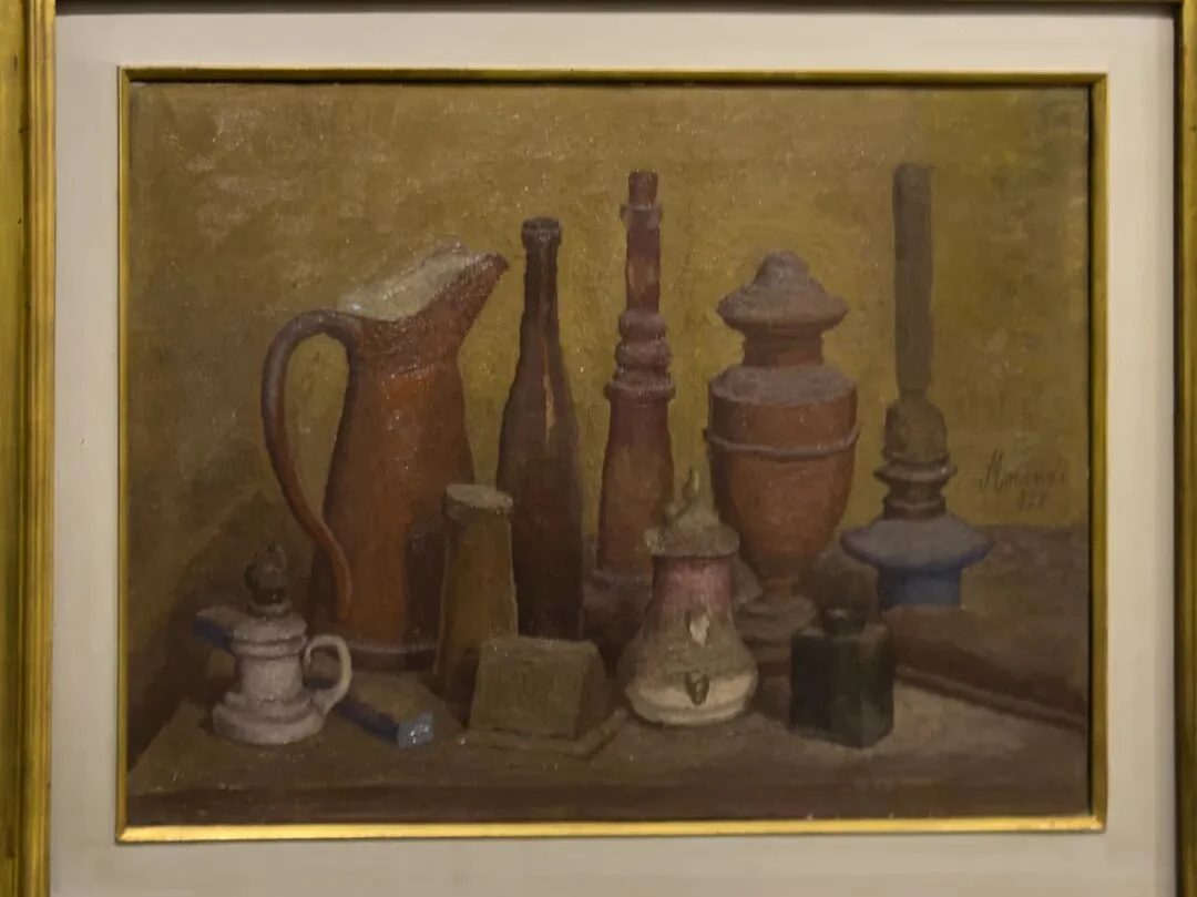
V.n.128, oil on canvas
The four paintings beginning here can be treated as a group. This is the earliest. Here there is a jug with a handle, a slender-necked bottle, something like a lamp or a candlestick, a small jar, and a box, forming at least two layers front to back, with very large differences in height. Let's forget for a moment what they “are” and do an experiment: trace the contour formed by the upper edges of the objects, and you'll find that the whole composition is a jagged skyline.
What's more, the composition of this painting is, you could say, airtight. The distinction between back row and front row rests mainly on overlap. So it is hard to tell how many centimeters one bottle is from another. The painting feels like a wall. Morandi's still life at this point is a closed plastic system.
17.
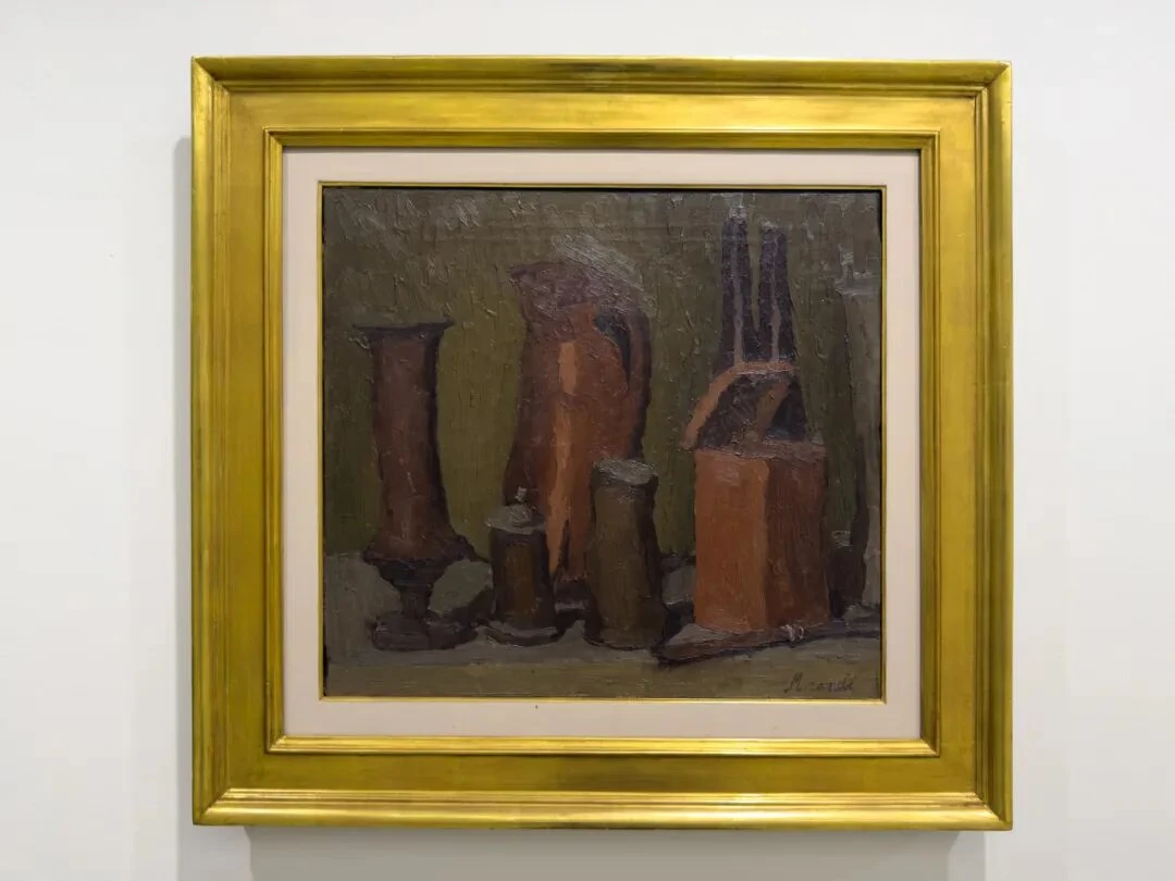
V.n.155, oil on canvas
The feeling of a closed plastic system is even stronger in this one than in the last. What the painting depicts comes close to a colonnade of varying heights. The tall, thin object on the far left, the large handled jug in the middle, and the object with a two-pronged top on the right (two long-necked bottles) make the whole picture stand firmly upright; the small jars below are like their plinths, so that each thing plays two roles at once, object and structural unit.
The color in this painting is very heavy, and the distribution of hues very concentrated—a far cry from the “Morandi colors” of later popular impression. The close values of the different colors and the heavy paint surface hold the picture together.
18.
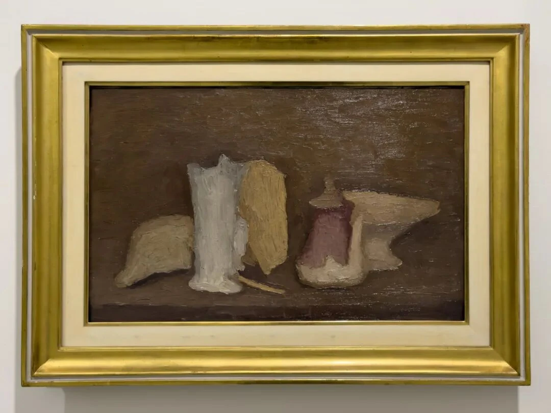
V.n.157, oil on canvas
Note the date: this was painted in the same year as the previous one. Almost all of the crowdedness of that painting has disappeared. On the left is a pale, dome-like composite form with a long, thin dark neck sticking up from its top; I really can't tell what it is.
What is rather interesting is that a real gap, a real interval, appears in the middle of the picture. To the left of this interval the objects are crowded together, closing one another off; to the right, the fruit bowl spreads out to either side, its contour like a crown opening out horizontally. One side low and round, the other high and wide, and the blank between them is in effect being pulled back and forth by the tension of two opposing forms. Morandi's skill at handling gaps keeps growing: the gap itself has its own weight and scale. Here I'm reminded again of Bread and Lemon.
19.
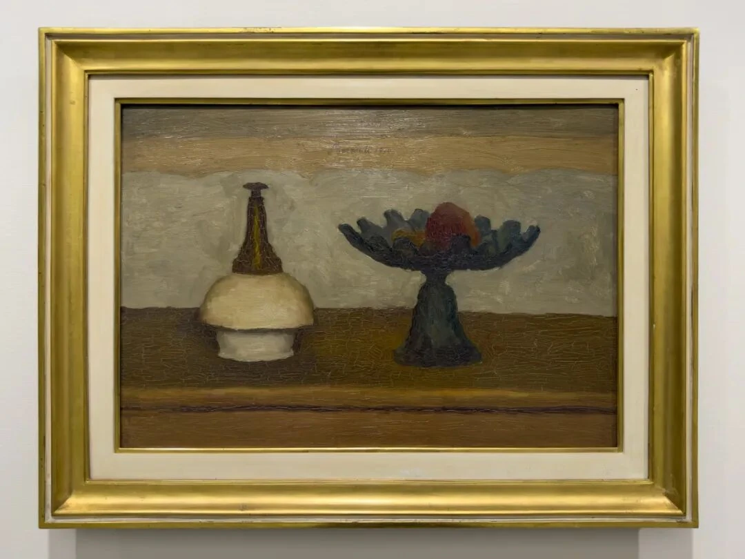
V.n.165, oil on canvas
My favorite of the four. So elegant. I have no idea what the thing on the left is. You can roughly make out that it might be a bottle, a jar, a box, or some other vessel from the studio, but you just can't pin it down. Its edges look as if a few corners had been shaved off, and the yellow form behind peeks out from beside it, the two almost stacking into a single whole.
At the end of the exhibition there is a quotation of one of Morandi's famous lines: “Nothing is more abstract than reality.” The objects still come from real things in front of him, but once Morandi has reorganized their colors, contours, overlaps, and spacing on the canvas, the question “what exactly is this thing?” matters less and less.
And note especially this: the right shoulder of the bottle on the left narrows from the broad, round body toward the slender neck, forming an arc that lifts toward the upper right; the lower left of the fruit bowl on the right narrows from the rim toward the stem, forming an arc that drops toward the lower left. They are of course not symmetrical, but because of the blank between them, they set up a clear relation of call and response. The dark horizontal line of the back edge of the table happens to pass right through this relation. The point at which this line passes is very cleverly chosen, and the same line does different things to the two objects: on the left, it cuts across the swelling volume of the unidentifiable object; on the right, it gives the small base of the fruit bowl a sense of being supported as it gathers downward.
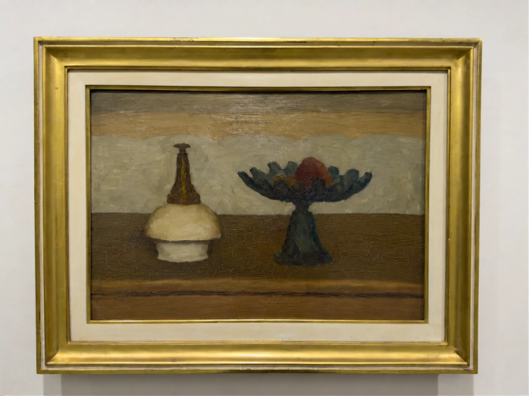
I used AI to move this line up a bit, so you can get a feel for how precisely the dividing line in the original is placed. Because the line is now centered relative to the objects, the tension of the original—arcs flickering in and out between the horizontal orders—becomes extremely explicit on the one hand, while on the other the table takes up too large a share, so that it actually loses its tense relation with the horizontal zones of the background. Those horizontals are supposed to be the compositional skeleton running across the picture. Now the table has become too much like a table.
20.
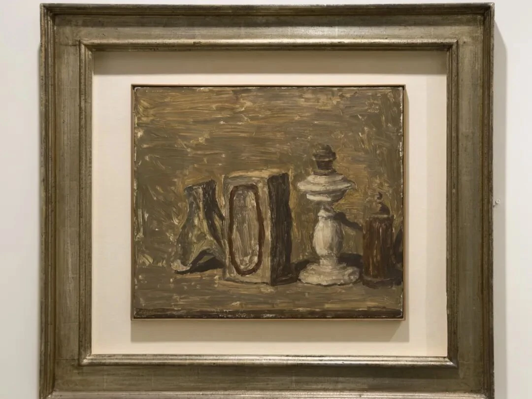
V.n.167, oil on canvas. Enos and Alberto Ferri Collection, on loan to the Museo Morandi
Another quite different Morandi still life. Notice the brushwork. The paint is thick, and the background is built up stroke by stroke out of horizontal and diagonal marks. The edges of the objects are not very definite either.
The white object is interesting; it is the brightest patch in the whole picture. And, as usual, you can't tell what it is.
21.
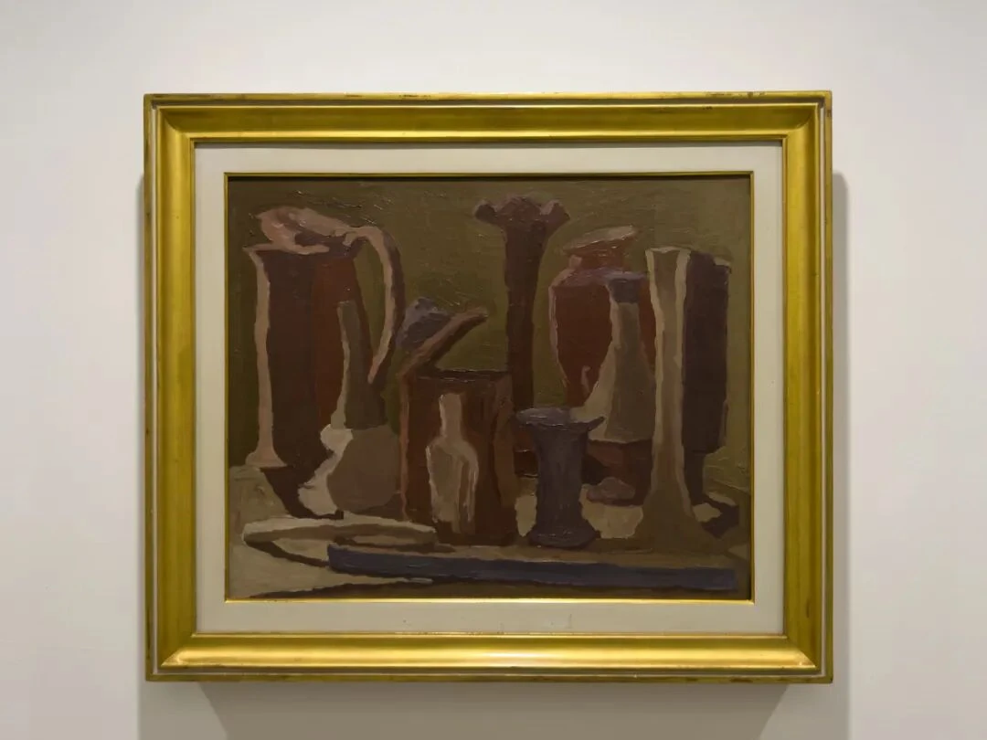
V.n.208, oil on canvas. Collection of Augusto and Francesca Giovanardi, Milan
In this period Morandi seems to be testing, over and over, the substantiality and stability of objects themselves. Many of the contours here look as if they had been repainted again and again along their edges afterward, and between the different colors there is almost a kind of jump cut. The tall rectangular thing on the far right is especially striking: it looks both like a vessel and like a wall. The blue-gray strip in the foreground has become almost entirely an abstract band of color.
Morandi keeps making the bottles stable and then unstable; although they haven't toppled over, they still seem to be disturbed by something coming from the painted surface, or from the materiality of painting itself.
22.
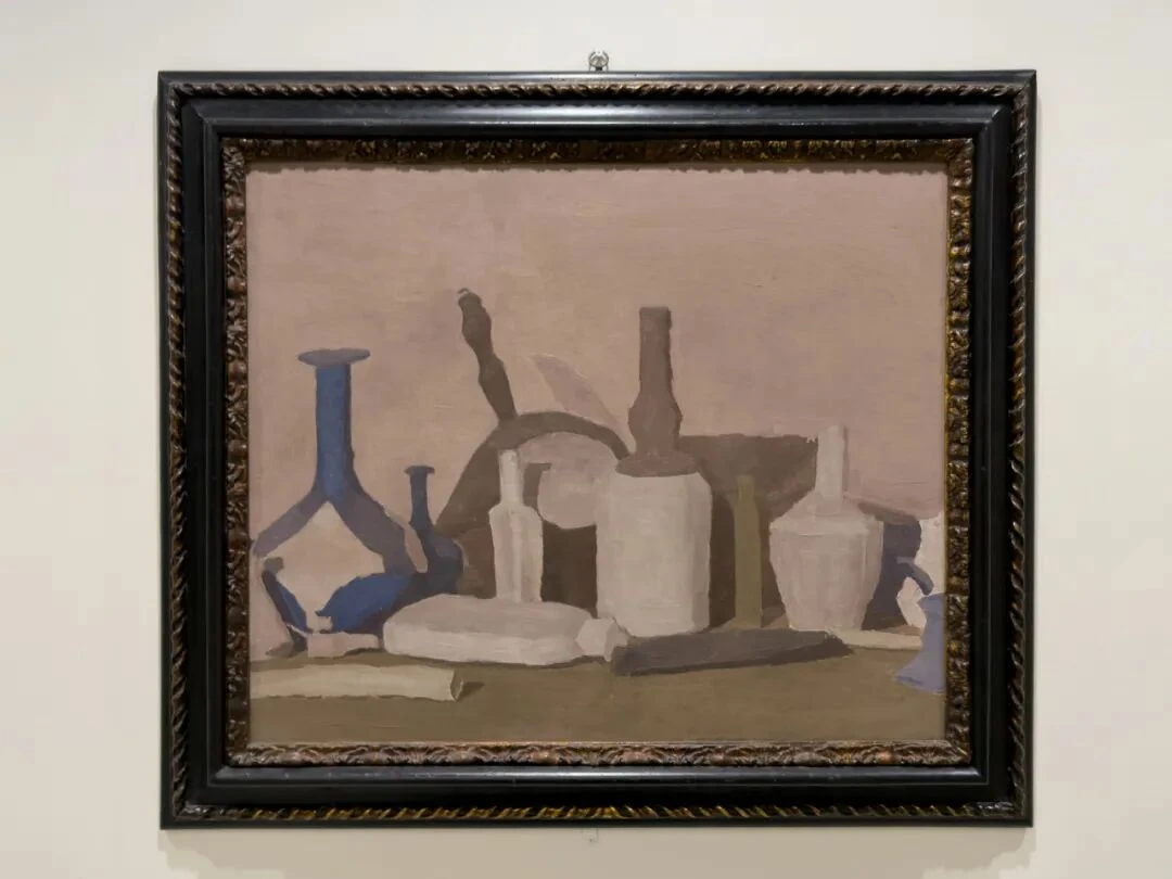
V.n.222, oil on canvas. Fondazione di Studi di Storia dell'Arte Roberto Longhi, Florence
The contours in this work are indistinct too. Although the objects themselves have become very clear, this is not a return to the metaphysical painting of the 1920s. Take the large cluster in the middle: it is hard to recognize at one go what each of the things “is.” The curved handle even seems like a thread stitching the back to the front. The whole picture is very bright; the background has become one large expanse of grayish-pink light.
The blue on the left is crucial. It is shaped like a tuning fork, and its job is to connect several very small fragments of blue. The lower left, the far lower right, and the bottom center of the picture all have blue-gray echoes of varying strength.
23.
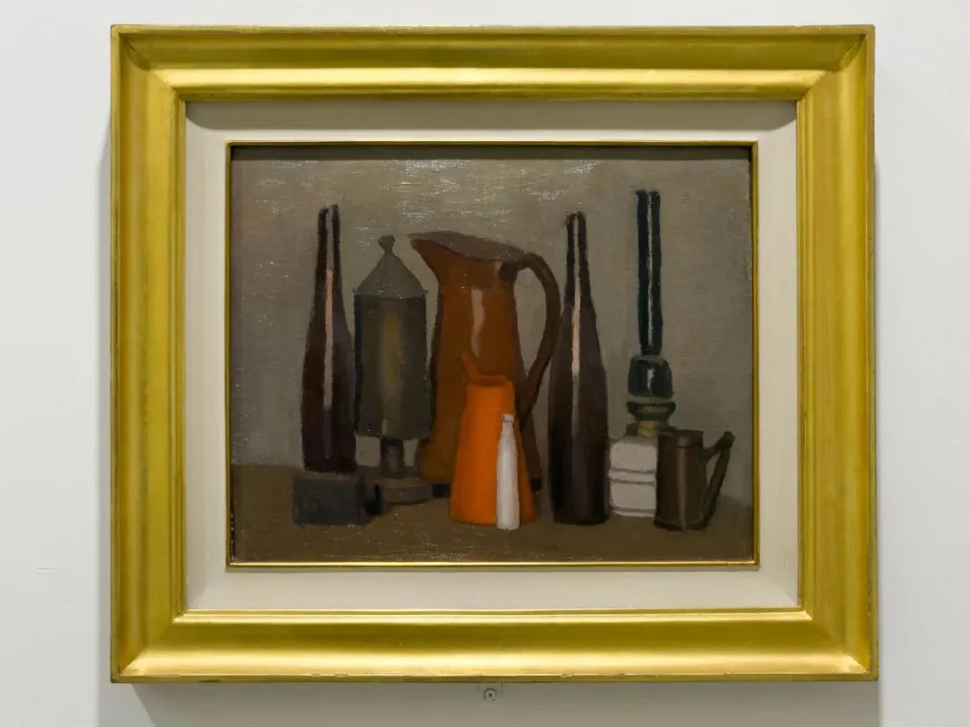
V.n.231, oil on canvas. Collection of Augusto and Francesca Giovanardi, Milan
This one is especially strange. Going back through my photos at home, I felt the objects had a strong monumental quality; he painted these bottles and jars so that they feel like skyscrapers. The thing is, the painting measures only 29.8 × 37.6 cm.
In this 1938 painting by Morandi, there are many objects, yet they are arranged with unusual clarity. This is very different from the state of 1936, where everything smeared together into one mass. On the surface, the most eye-catching thing in this painting is the bright orange jug in front, but what really steadies the painting is its vertical rhythm—the two long, thin dark bodies on the left, the big jug in the middle, a dark bottle to its right, and, further right, that black object like a lamp base, forming almost five columns of different thicknesses. The small bottles and boxes in front hold these verticals up from below, like plinths.
There is another thing worth noticing: gaps between objects have reappeared. In V.n.208 of 1936, the forms were squeezing and passing into one another. Here, even though there are many objects, each one manages to keep a bit of contour of its own. So our gaze can rest carefully on each bottle in turn and move between them. With the 1936 painting this is much harder to do, because we can't help seeing those bottles with their interpenetrating contours as a cluster.
This is what is so interesting about Morandi in the 1930s. What does a “whole” mean? How many bottles or objects can make up a whole? And what kind of mutually disturbing relation might this whole have with the materiality of the picture itself (paint, contour, and so on)?
The Morandi of this 1938 painting looks calm and quiet, but he had just come through the disturbance, in 1936 and 1937, of the wholeness of objects by the painted surface.
The White Fluted Bottle
24.
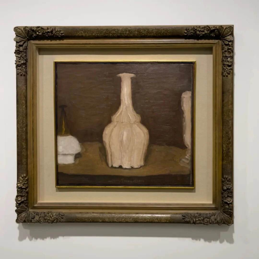
This painting of the white fluted bottle had center stage in the gallery. And this room suddenly carried the Morandi of the 1930s into the 1950s. Through the repeated appearance of the same white fluted bottle, perhaps we can get a sense of what Morandi's “repetition” is actually doing.
The strangeness of this composition may be unmatched in the whole exhibition. The objects on the left and right are simply cut off by the frame, leaving only parts of them. What comes first in this painting is cropping. And yet when we talk about Morandi we usually start from how carefully he arranges blank and negative space. The composition here is very much like the grammar of photography. Of course, this shouldn't be taken to mean that Morandi was imitating photographs. What Morandi is doing is closer to thinking about what “framing” itself means. For Szarkowski, the “frame” is only one of the five elements he takes to make up the nature of photography. The bottle in the middle has a strong sense of scale and of architecture, and this is precisely because the objects on either side are truncated: we lose the complete reference points we would normally use to judge its size, and so a tabletop vessel suddenly takes on a kind of monumentality.
Earlier, the houses of Grizzana looked like bottles; now it is the other way around—the bottles look like buildings.
25.
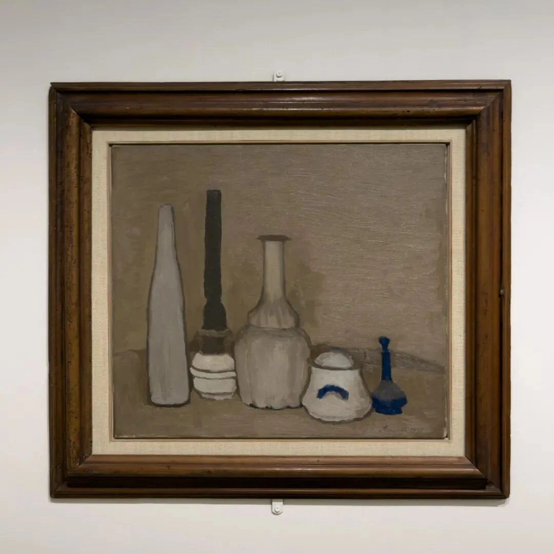
V.n.241, oil on canvas. Museo Morandi, Bologna
The spatial arrangement of this group of bottles is entirely horizontal. There is not much overlap, and each one keeps a clear vertical contour. But this is exactly where the magic lies: these five things are each completely different in height, width, value, and color, like the five voices of a piece of music. The grayish-white bottle on the left is somewhat broad, the black oil lamp in the middle extremely thin and tall, the white fluted bottle swells out wide again, the sugar bowl on the right is broad but suddenly low, and last comes the blue bottle, suddenly shrunk very small. Looking across, what the eye feels is the sequence wide—narrow—wide—low—small. Extraordinarily rich.
Seven years after the fluted bottle of 1932, the bottle that once had monumentality now joins other objects in making up a visual syntax. The relations between objects are becoming ever more mature; the importance of the single object has declined, and the rhythm of the group as a whole has become more important.
26.
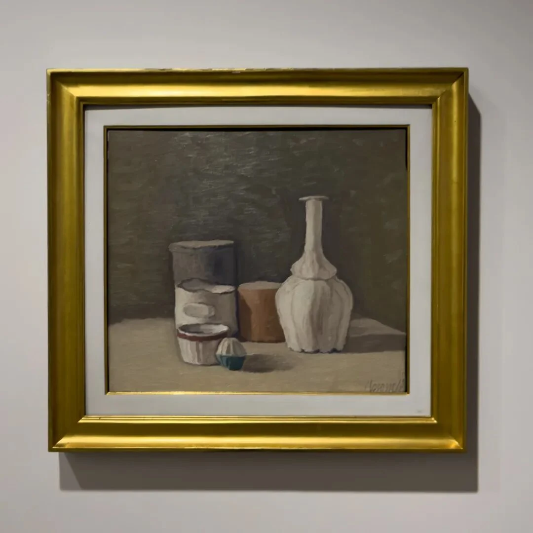
V.n.763, oil on canvas. Collection of Augusto and Francesca Giovanardi, Milan
Suddenly we are in the 1950s. A drawing hangs beside it, too. Notice the tiny blue-green thing at the front of the picture. Why not try taking it out and see what happens?
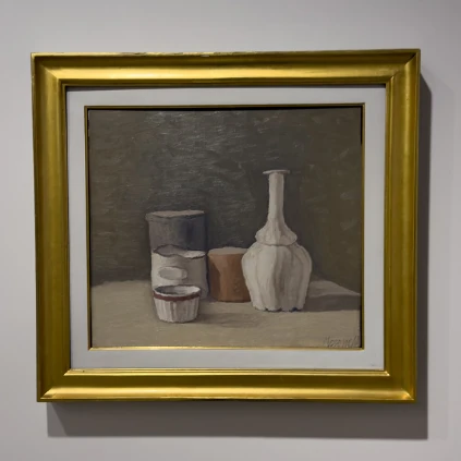
This little patch of blue-green actually carries a great deal of visual weight. The color key of the whole picture is grayish brown, milky white, and earthy orange; a sudden touch of blue-green immediately pulls the visual center downward, and at the same time keeps the fluted bottle on the right from becoming the sole protagonist. That is to say, smallness of size does not mean smallness of structural weight.
27.
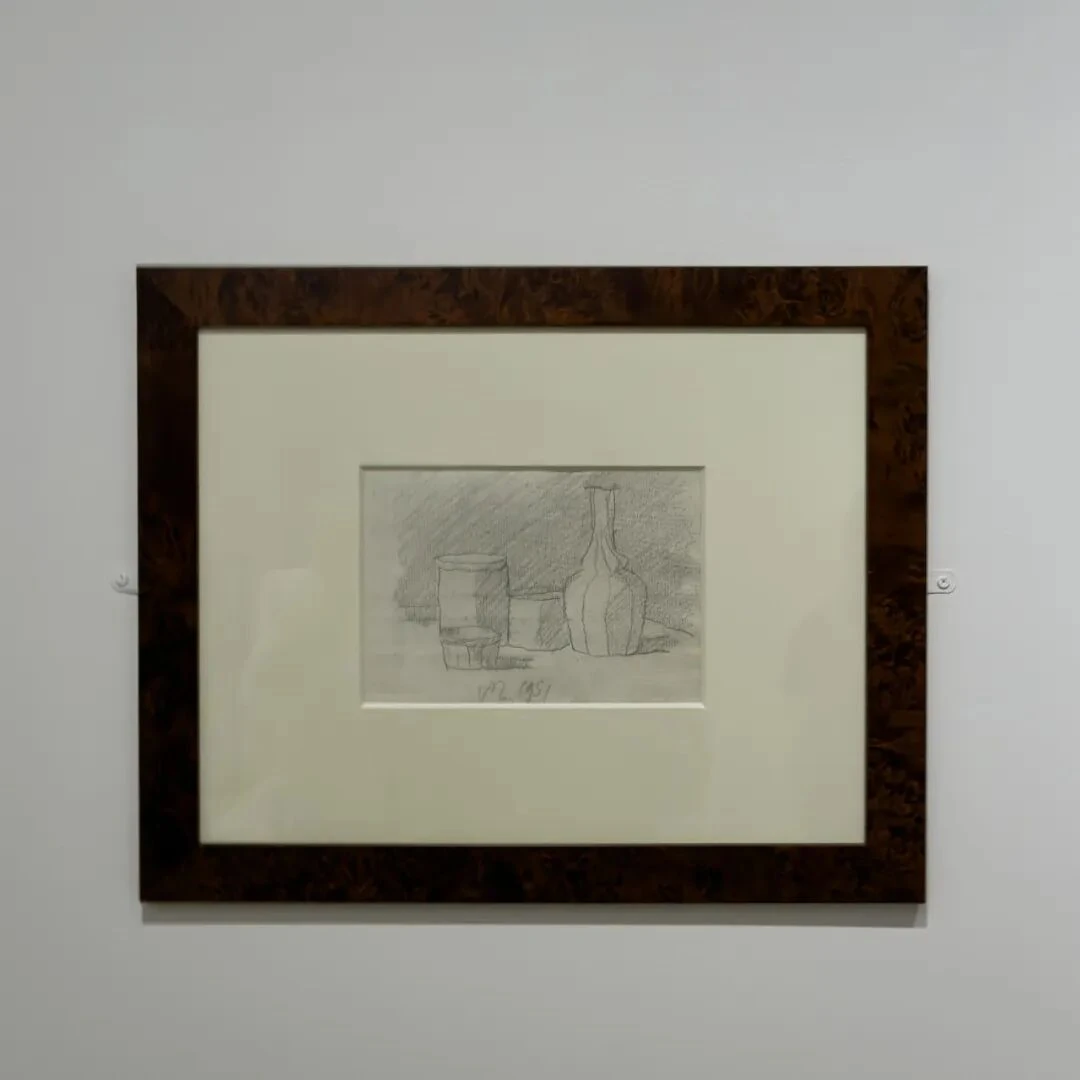
T.P.1951/2, pencil on paper. Museo Morandi, Bologna
What is worth noticing in this drawing is that what Morandi really draws here is precisely the lines of contact between objects and the horizontal line of the tabletop. Whether the objects themselves get drawn in full is not all that important.
28.
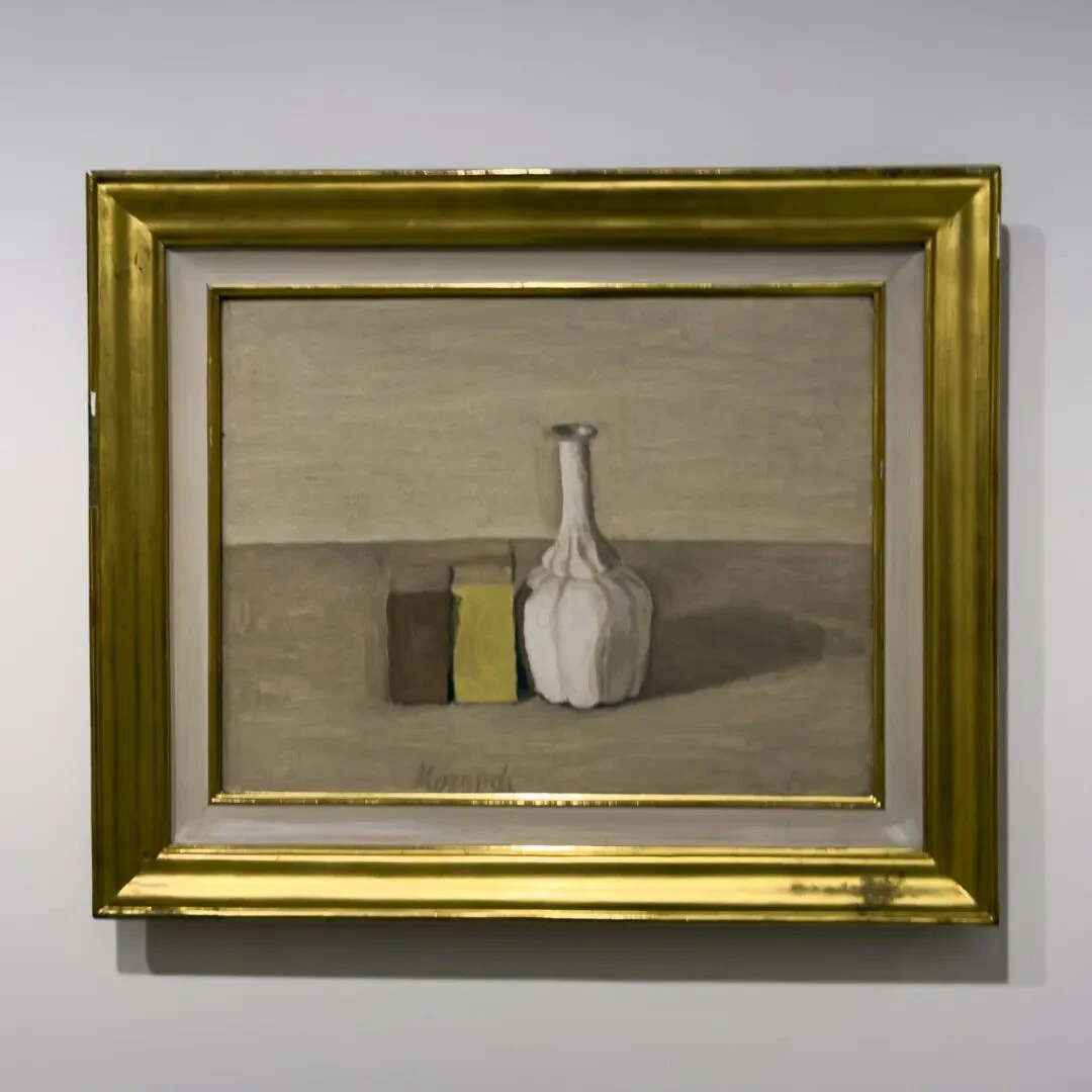
V.n.902, oil on canvas. Private collection
This painting is more interesting still: just two parallelepipeds and a fluted bottle. The boxes on the left have nothing of daily life left in them. The late Morandi grew more and more fond of these blocklike forms. If you compare this 1954 painting with those 1928 paintings where a dozen or so objects are crowded together, you find that Morandi did not actually become “simpler.” Quite the opposite: he became highly complex, and complexity here means precision. Now every millimeter matters; each one condenses more of what is necessary for the relations to hold. That is to say, if this hexahedron were moved a little further to the left, the whole set of relations among the objects would come apart. If the shadow were a bit darker, it would turn into another solid.
I'm reminded again of Morandi's line: nothing is more abstract than reality. By 1954, “abstraction” no longer had to be bought at the price of destroying the object. The fluted bottle is still a fluted bottle, the box still a box, but their particular uses hardly enter into the meaning of the picture at all. What really determines the meaning of the picture has become height, color patch, value, contact, interval, cast shadow, and the color field of the background. The object is a constraint, and painting has to produce almost endless variations within that constraint.
People's image of Morandi always seems to be something close to a “recluse,” but by this time Morandi had won all sorts of major prizes and his exhibitions were very well received; he had, by any measure, made it. By painting the same things over and over, by fixing his objects, Morandi actually made the relations themselves visible.
Landscapes Turned Still Life
29.
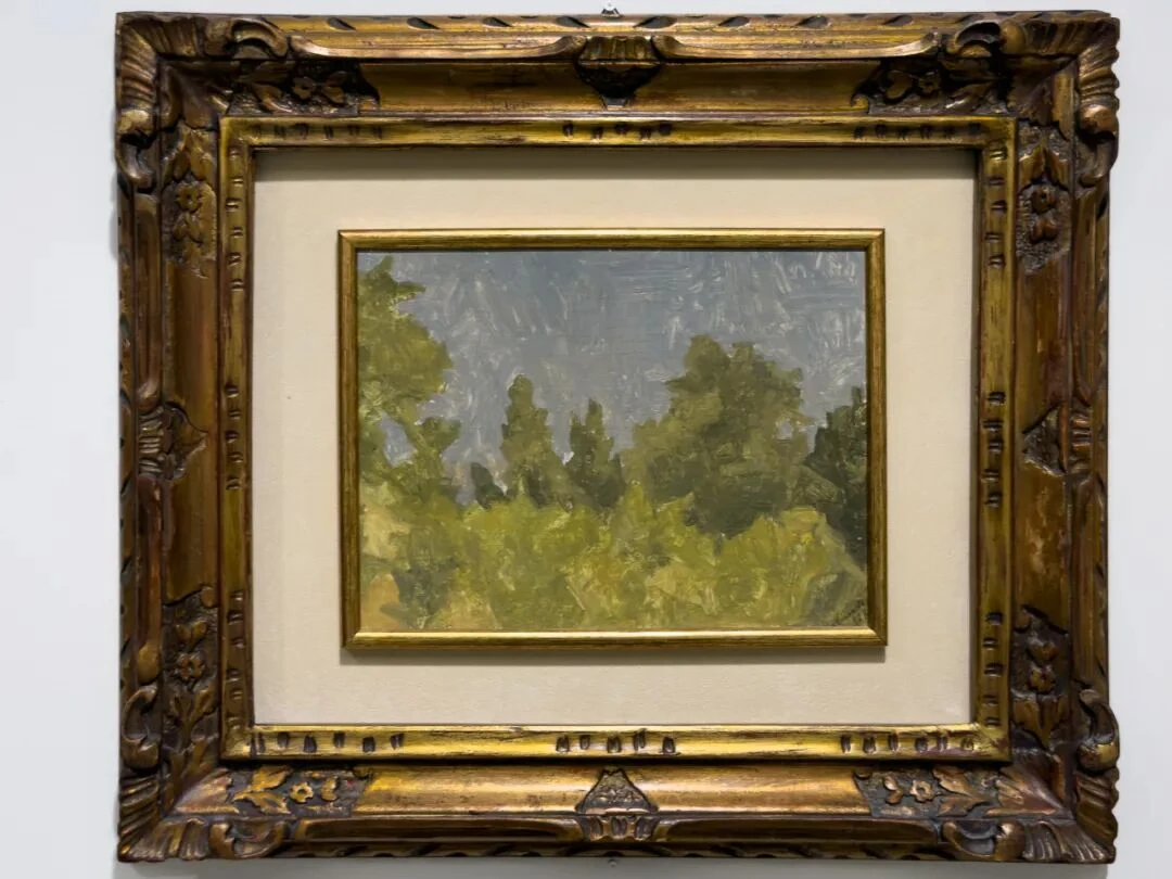
V.n.81, oil on canvas. Private collection
Escaping the phalanx of bottles for a breath of air. Suddenly we are back in 1923. This is the period after Morandi left metaphysical painting behind. In 1920 he had seen Cézanne at the Venice Biennale. After that he entered a period of drastic change, trying to perceive nature more directly. This painting is representative of that.
What is interesting is that this painting has no definite subject. The whole picture is made up of just three parts: below, a large expanse of vegetation mixing yellow-green and ochre; in the middle, the uneven contour of the treetops; above, a gray-blue sky. So it is closer to a visual cross-section.
Likewise, the trees are not seriously painted as actual trees: most of the crowns are masses built up out of strokes, and only here and there does a spire-like treetop suddenly poke up. Already here we find an operation that becomes especially important in his later still lifes: much of the information inside the object is deleted, leaving only the contour and the overall sense of mass. We know this is a tree, but there is no need to prove that it “is” a tree by naturalistic means.
In addition, the painting gives a compressed feel, like telephoto perspective: the shrubs in front press right up against the woods in the middle, and the woods in turn block off the sky like a wall. Only, this compression is produced entirely by painting.
30.
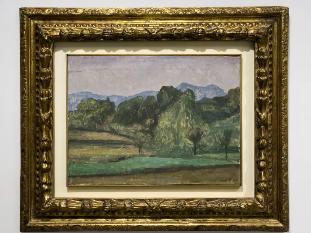
P.2016, 1929/2, oil on canvas. Private collection
Six years later, the sense of space returns. But the thing is, although this painting has a distance, it still does not look like a scene with depth in the traditional sense. That is because Morandi treats each layer as a horizontal band of color. Spatial depth comes from the stacking of color patches. This corresponds very interestingly to his still lifes of the same period.
Note especially the blue mountain range farthest back in the picture. They are the far distance, yet there is no obvious blurring from atmospheric perspective; their contours stay clear and form a fairly definite boundary with the purple-gray of the sky. So the sense of distance of these mountains becomes very odd: by reasoning, they are of course far away, but as far as perception itself goes, they are closer to a blue silhouette pasted directly onto the upper part of the picture.
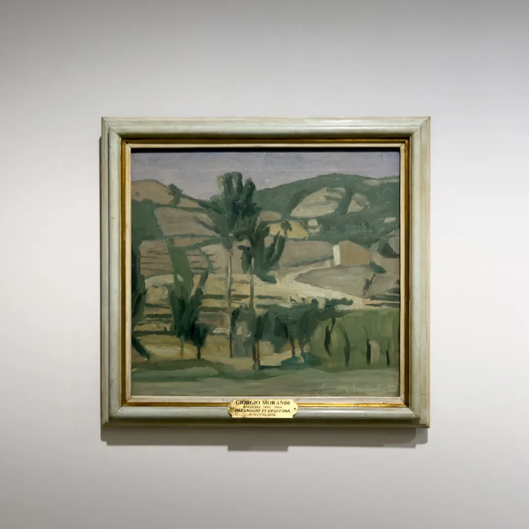
This was the period in which Morandi was painting a great deal of the landscape of Grizzana and the countryside around Bologna, as we have already seen in some earlier sections.
Moreover, if you set the 1923 and 1929 paintings side by side, you find a clear change in the brushwork too. In 1923 the strokes are more concentrated locally; each tree, each clump of bushes is still relatively independent; but in this painting the strokes increasingly submit to larger composite color fields, especially the fields and the distant mountains, which are closer to a few large planes. So the recognizability of individual objects gradually declines, while the overall relations grow stronger and stronger.
Think back to the two house paintings of 1927 and 1928 and you'll see: even without a house, Morandi can still build the same structure out of mountains, woods, and fields. That is to say, what Morandi really needed was never any particular “object.” You could even say that bottles, mountains, trees, and fruit are all interchangeable for him. This is also why Morandi could take on, in landscape painting, an image as rarely seen as modern infrastructure.
31.
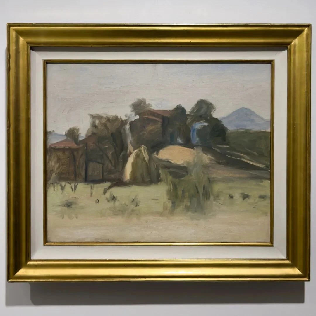
V.n.215, oil on canvas. Museo Morandi, Bologna
By this time Morandi's way of handling landscape had changed considerably. Compare it with the 1929 landscape we just saw. Here the terrain is closer to horizontal banded structures, and buildings and trees become vertical condensations passing through these bands. There is no picturesque experience of the countryside in a painting like this. It has a very strong sense of construction: this is a landscape turned still life. The table edge is the horizontal, the bottles are the verticals. For a painting of the outdoors, the fields are the tabletop, and the trees and houses are the bottles.
32.
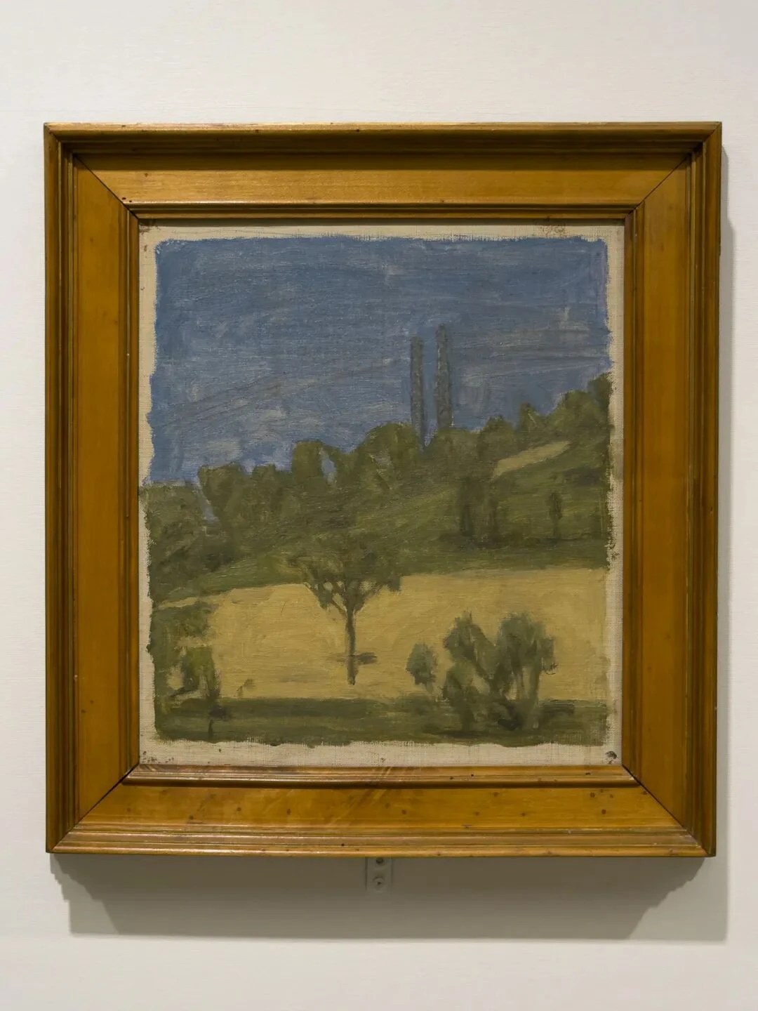
V.n.277, oil on canvas. Fondazione di Studi di Storia dell'Arte Roberto Longhi, Florence
This one interested me enormously at the time, because modern infrastructure plainly shows up in it—electric wires. The two vertical members in the distance and the wires are recognizable at a glance as having to do with modern technology, but Morandi does not treat them the way Futurism would. He had come into contact with Futurism when he was young, but by this time he had completely absorbed modern things into his own grammar. The poles do not primarily signify “the modern” or “electricity.” They are more like two extremely thin long-necked bottles.
So this is what I was saying a moment ago: Morandi has landscapes turned still life precisely because the crux here is the function of shapes.
The blue and yellow in this painting are also interesting: the blue sky takes up a very large area, and the yellow field is also very complete. Squeezed between them is a fairly narrow strip of green woods, so the depth of field is actually quite limited. By reasoning, we still know that the ground is in front, the trees in the middle, and the sky behind, but what we actually feel in front of the painting is more like three color patches bordering one another. Their flatness is very strong.
Pay special attention to the single tree standing in the yellow field in the foreground, because it adds, between the two large color fields above and below, a ruler for marking out space; without it, the whole picture really would become the kind of purely flat painting that Greenberg championed.
33.
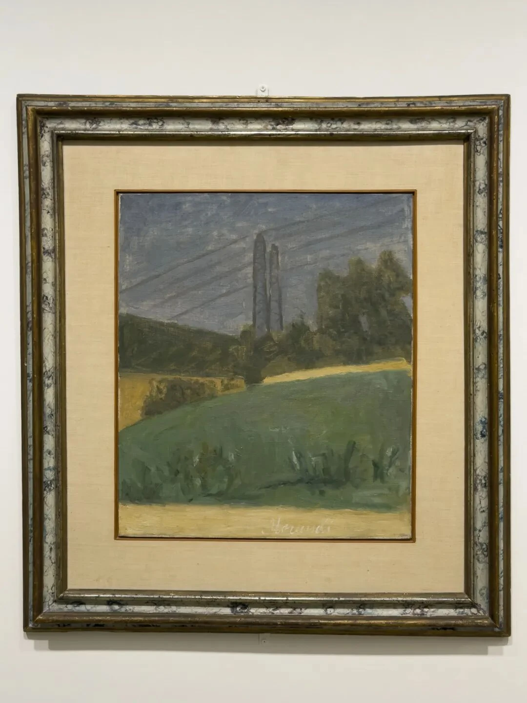
V.n.276, oil on canvas. Private collection
What is interesting about this painting is that the wires have an even stronger presence than in the last one. As a result, the whole picture acquires a rare directionality: the sky is crossed by long lines, and the slope of the ground tilts along with them. Morandi clearly did not delete the wires in pursuit of some kind of purity. You can see from this that as long as something can enter the picture and take part in organizing its spatial relations, it already has all the legitimacy it needs to be painted.
34.
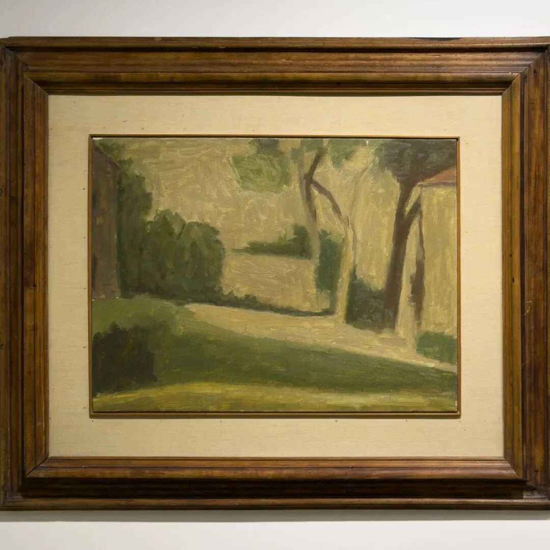
V.n.461, oil on canvas. Collection of Augusto and Francesca Giovanardi, Milan
This painting stands out too. 1943 is a rather special year: in May of that year Morandi was arrested and held for a week in the Bologna prison. And, as everyone knows, this was wartime.
The position of the horizon is worth thinking about. In his paintings of the 1920s the horizon could still indicate space and depth, but after 1936 it feels more and more like something that marks the seam between one composite color field and another, and in the painting before us we can basically forget the horizon's role of indicating “ground.” There is only a yellow rectangle, a blue rectangle, a green band, and a few vertical lines. That is to say, it in fact already shares one and the same mechanism of looking with pure abstract painting.
35.
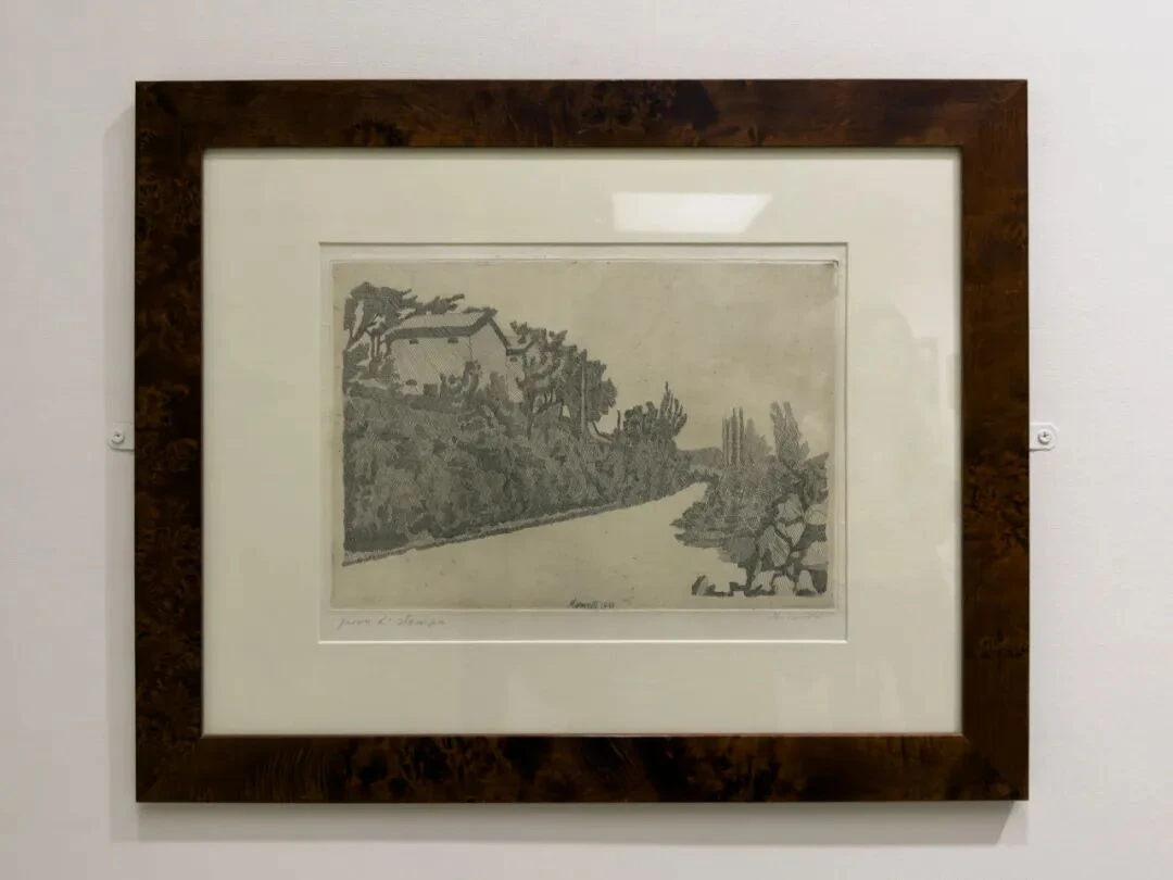
V.Inc.n.104, etching on copper. Museo Morandi, Bologna
Morandi painted the same spot in Grizzana again, eight years apart. This is the earlier of the two. The print is extremely small. The “white,” of course, just as in Bread and Lemon, comes from the absence of etched lines. And vice versa.
36.
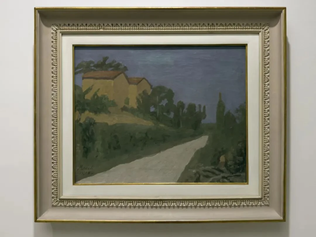
V.n.341, oil on canvas. Collection of Augusto and Francesca Giovanardi
The point is what happened eight years later. He kept the same structure but in fact changed it thoroughly. The most obvious thing is the road. In the earlier etching, the edges of the road were still rather complex and the surrounding vegetation fine and dense, so that the white road seemed to be breaking free of its surroundings. In this oil painting, the white road itself has become unusually whole. If we set aside for a moment its identity as a road, it is the brightest and most directional geometric shape in the whole picture. And for that reason it also enters into a very peculiar relation with the sky. Above is a large area of blue-gray, below a large area of gray-white. In between, a band of dark green vegetation separates the two zones. At the upper left, two yellow-ochre houses press down on the green slope like two small rectangular blocks. So the painting can be understood as four composite color fields.
By this point Morandi's landscapes are very close to abstraction. But he never crossed that line in his whole life. However much it shares the same grammar with abstract painting, we still know that it “is” a road, and we still know that on the left there “are” houses and on either side there “are” trees. This “still knowing” is crucial for Morandi, because the reality of the actual object provides resistance here. If the road were to become entirely a white triangle, there would be no point in taking such pains over the relations in the picture. Morandi always worked to keep it in two states at once: a particular place, and a patch of color.
More interesting still, if you compare the print with the oil, you sense that the road in the print has an obvious depth and can lead the eye from the foreground into the distance. But the road in the oil painting doesn't really obey this perspectival logic, because it is simply too bright, too close to a patch of color. Our eyes both follow it into the distance (cognition tells us this “is” a road) and keep getting pushed back by it onto the picture surface, feeling the materiality of the picture itself.
In fact Morandi painted this road many times over those eight years, which is to say that the road, too, is one of the fixed objects of his paintings. As soon as a real object enters Morandi's paintings, it immediately starts to approach the bottles.
Viewing it in person, if you come a little closer and first fix your eyes on the road, not the houses, and then slowly widen your attention to the green banks, the yellow houses, and the blue sky, you'll find that the so-called “landscape” is actually filled in by the mind bit by bit as our attention moves. What you feel first is nothing but a few shapes. But if you look at the 1933 etching, things happen in the reverse order: we first see the black-and-white organization of the scene, and only then realize that it is made up of countless extremely fine lines.
So when exactly does the visual relation formed by a group of painted objects become a “tree” or a “house,” and when does it shake off the reality of actual things? This question gets explored in the second half of the exhibition in a way so brilliant it is almost outrageous, especially in the representative still lifes of his prime.
Because of limits of time and energy, I looked at the second half of the exhibition rather hastily.
Shells
37.
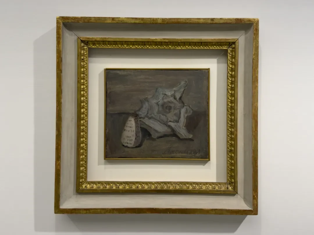
Shells hold a rather special place in Morandi's still-life system, because their geometric shape is not regular.
This kind of large conch has dense openings inside and edges that fold inward, so here Morandi has to handle not only the overlaps between one object and another, but also the folding within the large shell itself. That is to say, the shell gathers into a single object a problem that used to be distributed among several bottles.
More important, these large conchs have one thing in common: unlike bottles, they don't have a “front.” What I mean is this—if we try looking only at the large conch, isn't it hard to feel that it is “standing on the table”? Imagine there were nothing in the picture but this conch: wouldn't it look like a conch collaged onto a two-dimensional plane with a dividing line across it? This is why the large conch is always accompanied by a small, neatly edged, conical shell. The small shell is nowhere near the conch in volume, but it gives a definite feeling of “standing on the table.” In V.n.438, the slanted edge at the very bottom of the large conch hardly gives the impression of bearing any weight. So it is the relation between the small shell and the table that does the work of providing an impression of space.
That is, the small shell actually serves as a kind of ruler. It marks out the space, and it also marks out the scale of the large shell, because that little cone lets us realize how big the large conch on the right is.
At the center of each of these large conchs is a spiral. The spiral is interesting in itself: it contains both growth and closure, and yet its center is indefinite. The shell itself calls up our associations in just this way.
38.
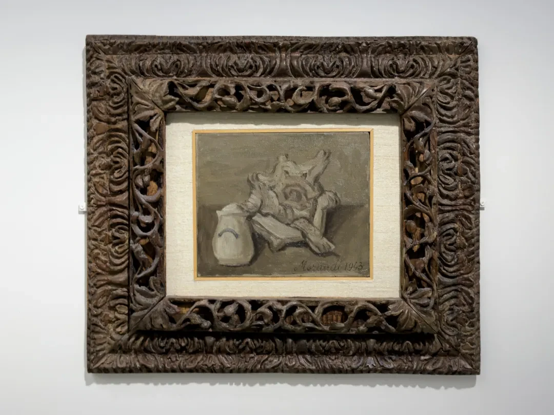
V.n.443, oil on canvas. Private collection.
This one is rather special: the conical shell has now become a sugar bowl. This opens up quite a bit more room for interpreting the painting. Of the eighteen shell paintings from the war years, this is the only one that puts a shell beside a sugar bowl. Next to the twisted shell, suddenly, there is an object bound up with everyday life. The sugar bowl has a small stroke of blue decoration on it. It is regular; it belongs to the world of geometric order that Morandi knows so well. The creature in the shell died long ago, and the spiral inside keeps generating an unstable tension that resists any fixed contour.
Wartime Landscapes
39.
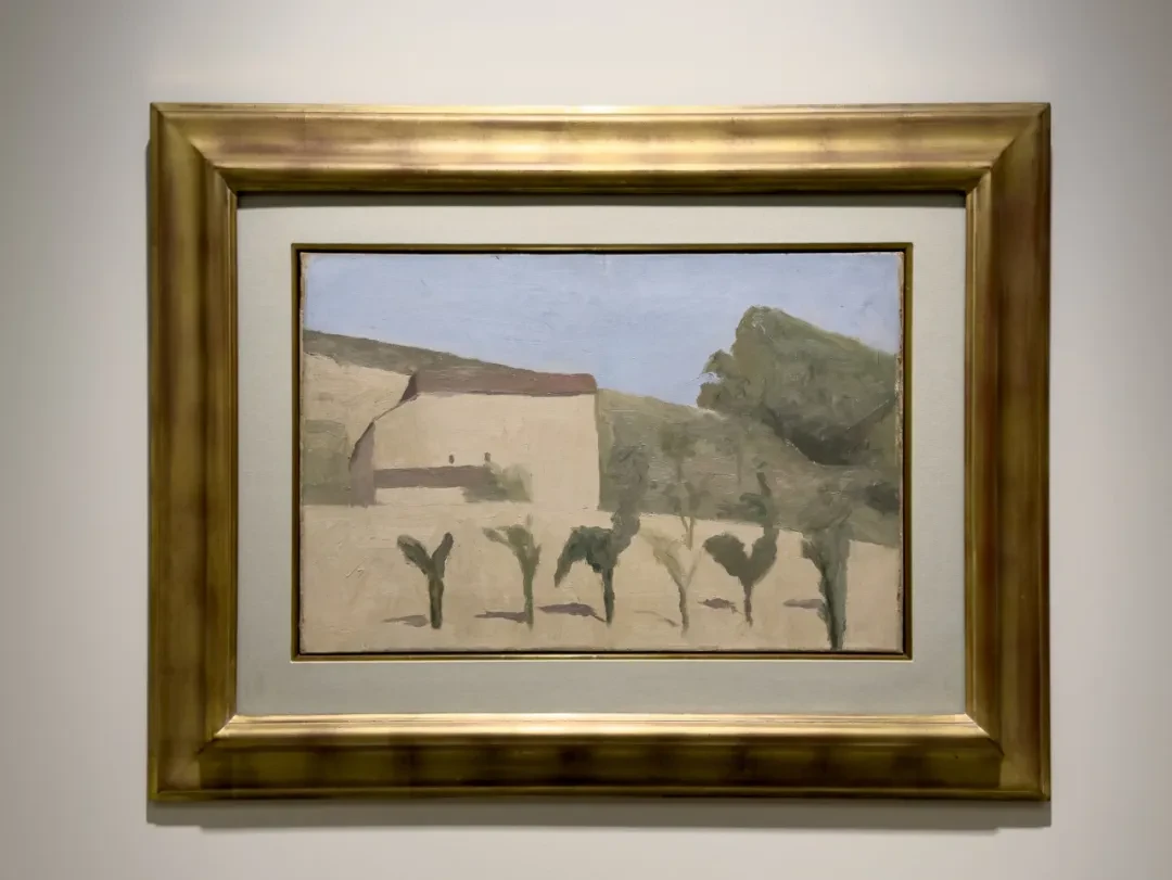
P.2016, 1942/43, oil on canvas. Uffizi Galleries, Florence
The pale house in the upper right has basically become an abstract wall without any detail, and the reddish-brown roof has turned into a line. The row of small trees in the foreground is especially strange, because they no longer have crowns in any normal sense; each tree is just a dark vertical stick with a stroke or two of leaves stuck on. Morandi gives this painting only the bare minimum of spatial cues. The tree shadows form very short, nearly parallel horizontal lines on the ground.
The color of the tree crowns in the background is very close to the color of the hillside, so whether they register as objects depends largely on their contours standing out against the mountains and on the presence of their trunks. Conversely, the more definite the trees in front, the more fragmented the hillside behind them is cut up.
40.
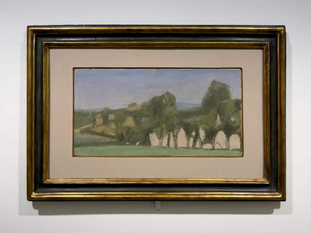
V.n.457, oil on canvas. Summit Trust, Geneva, Sidarta Collection
What is rather interesting here is the pale areas in the lower right, squeezed between the dark trunks. Those pale areas easily bring negative space to mind. In Morandi's Grizzana landscapes of the 1920s, the houses usually still had a definite recognizability, but already in the previous painting you can see that the houses are slowly starting to collapse into blocks of wall, and the trees, too, are becoming a kind of composite color field. That is to say, the trees, though clearly in front, often share the same tone as the more distant houses or mountains, and in that particular area the front-to-back order of space is unclear.
41.
V.n.457, oil on canvas. Summit Trust, Geneva, Sidarta Collection
The hills take up a large area of this painting. The pale wall in the upper left now has a definite roof, and the several grass-like trees below each have a trunk of their own. The foliage at the tops of these little trees is uneven (they are “Y-shaped”), but the points where they touch down and the horizontal lines running to the left basically string them together into a row again. Although the painting looks flat, its front-to-back order is very clear.
42.
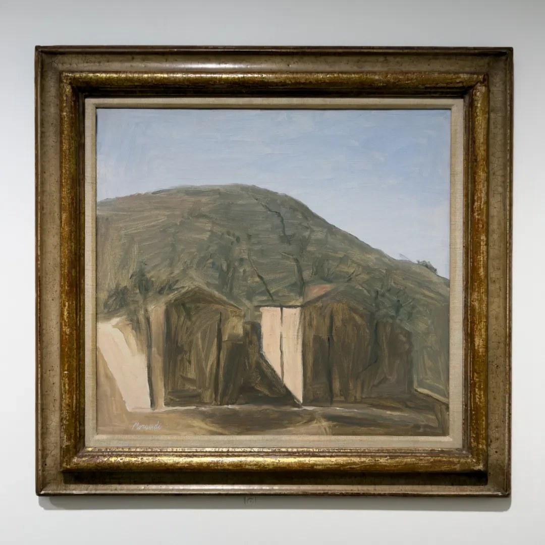
V.n.470, oil on canvas. Private collection
The brightest wall surfaces are all at the foot of the hillside, and those two pale walls are very conspicuous. The left one tilts a bit more than the right, and trunks and shadows keep dividing them up. If you look at them together with the whole hillside above, you'll find that all these forms are governed by one enormous slanted plane. The hillside is painted very full, and the dark parts of the buildings border directly on the hillside, so the roofs don't separate easily from the surrounding brownish green. That is to say, the contours of the houses are partly dissolved here too. As a result, the weight of the mountain and the weight of the houses are very unequal. Without these few pale, upright lit planes, the houses could hardly keep up their own existence at all.
The Mature Still Lifes
43 & 44.
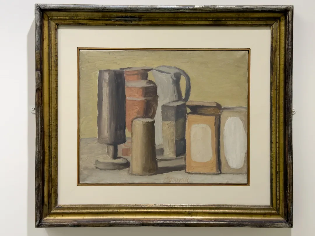
P.2016, 1941/3, oil on canvas. Eni Collection.
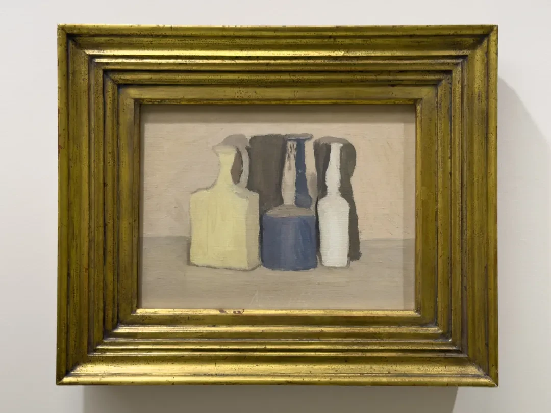
P.2016, 1941/3, oil on canvas. Eni Collection.
Look at these two together. The 1941 one still has a fairly strong sense of display. That is to say, although the bottles overlap one another, each is still quite distinct from the others; you can “look at them one at a time.” But by the 1943 V.534 this sense of distinctness is not so strong. The dark gray objects at the back have almost merged into one expanse.
Look at the 1943 one: the lower half of the blue bottle in the center is very definite, but if we cover the lower half and look only at the upper half, the neck suddenly brightens against the dark area behind it, so that the whole bottle is split into two parts of opposite value, which hardly even seem to belong to the same bottle. At the back right there is a narrow pale gap whose width and shape are very much like those of the bottle's neck. This is very interesting: only by looking from top to bottom, checking whether this pale strip connects to the shoulder and body of the bottle, can we fully settle what this pale band is.
That is to say, Morandi can now give the whole group of objects in a still life a very clear composite tone, while still leaving the shape of each single object something that has to be carefully made out.
45.
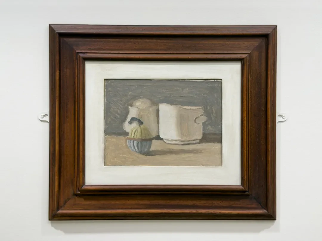
V.n.691, oil on canvas. Museo Morandi, Bologna
This one is lovely. The cylinder, the rectangle, and the little sugar bowl sit very close to one another. The lid of the sugar bowl just covers the bottom of the container at the back left, while the base of the container on the right is fully exposed. This gives two large pale blocks that would otherwise be very similar different front-to-back relations.
Worth noticing is the handle on the right. It is just a tiny arc sticking out from the right side of the large container, and its color differs little from the background. But once we notice this little thing, we realize at once that this vessel has a definite “side” (it is not a cylinder). Answering this tiny arc is the blue hook on the left, which is much heavier in visual weight and which connects with the bright sugar bowl below to become the center of the color relations.
The color, too, has come closer to the “Morandi colors” of popular impression. That honey-like beige and the dark gray make up the overall composite color field, and only a few vivid color nodes are left in the foreground. The low-saturation grays, off-whites, pale yellows, and blue-grays actually do the work of distributing spatial weight. The blue and yellow of the sugar bowl are brighter than the colors behind, but the bowl is much smaller in volume. These colors should be understood first of all as spatial coordinates. This already appeared in V.n. 763.
The painting has only three vessels, but the relations among them are still very rich. The small sugar bowl concentrates color and the visual center at the front; the two large objects take care of the broad lit planes; the cast shadows point us to the spatial fact that they share one table; and the gray-blue of the background, together with the beige of the tabletop, serves as the ground that makes “standing” possible.
Silk Flowers
46.
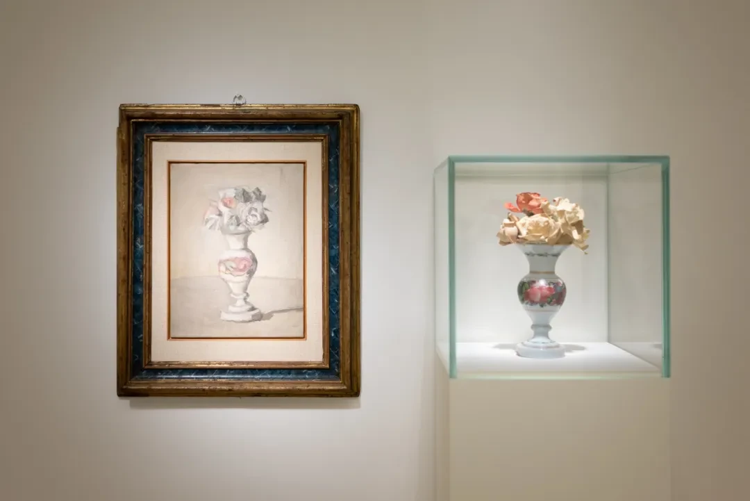
V.n.661, oil on canvas. Museo Morandi, Bologna
Photo by Hong Xiaoyu
Here the flowers are shown side by side with the actual object. The last flower painting we saw was the bouquet of fresh flowers from 1924. Here they have become silk flowers. The earlier flowers were scattered, fleeing, in great tension with the vase, but now the whole work has become strongly axial. The vase sits almost exactly in the middle of the picture: base, belly, slender neck, mouth, stacked layer upon layer upward, and finally the bouquet on top gathers into a compact crown. This flower painting feels like a full-length portrait of a person.
Since the actual object is on display, we can compare the two. The decoration of the real vase is very elaborate: on the white porcelain body there are vivid floral patterns, and there is a gold ring-shaped border. But in the painting these decorative patterns have been almost entirely compressed. Morandi doesn't emphasize the reflections of the glaze either. What is emphasized here is the rhythm of contraction and swelling in the vase's belly, and the composite tonal relations among white, pink, and gray. The porcelain had flowers painted on it, but Morandi summed them up as a ring of pink and grayish green. The belly of the vase is already its most swollen part, and the pink happens to be concentrated just there, making the belly stand out more than the narrow white neck and foot above and below. In the bouquet there is also a small patch of a similar pink, so that the pattern on the vase and the flowers above its mouth echo each other in color within the same painting. That is to say, what is decoration on the actual object can, in the painting, take a direct part in organizing the rhythm of the whole form.
This says a great deal about Morandi's relation to “realism” and to “abstraction.” Morandi does paint in front of a particular object, rather than working from the imagination as Cézanne did in his Bathers. But his so-called realism does not happen in the reproduction of the object's details. What Morandi is faithful to are certain relations that the object presents to our perception and our looking. Concretely, these relations are breadth and narrowness, weight, light and dark, distribution from top to bottom, the proportion of bouquet to container. Particular decorations, if they would interfere with these relations, can be compressed or even deleted.
Although the late Morandi leaned more and more toward “order,” and even his postwar flower paintings relied more and more on silk and dried flowers—objects that are nearly “eternal” in their temporality—and he basically stopped using fresh flowers, this does not mean he was moving toward classicism. Even though, on the surface, a pursuit of order and eternity easily suggests such an association.
As I see it, Morandi at this point is running directly counter to the classical ideal. The crux lies in the role of time. Morandi's work brings out difference through repetition. The root of classicism lies precisely in refusing to grant time any value—for the essence of things, time is nothing but a disturbance. Just as Fielding's Tom Jones looks on the surface like a novel using “modern” narration (meaning that it took the novel-writing of its day to the extreme in making sure that everything happens for a reason), yet its underlying values remain thoroughly classical: no matter what rotten things Tom Jones does, so long as he starts out a good man, he is a good man at the end of the novel too. So what is it that Morandi is doing?
To put it by analogy, what Morandi is doing is the method of controlling variables in an experiment. Classicism believes that things have some essence that can rise above the disturbance of time, and Morandi does not believe this. On the contrary, Morandi uses the method of controlling variables to let tiny differences show up in our perception. The object is just a trigger that allows differences in perception to appear. So the objects in Morandi's paintings have no ontological importance. Their importance depends entirely on the responses they set off in our perception.
This is where Morandi is complex and subtle. It will become even more evident in the “Variations” later on. What he is after is not some fixed, unchanging “essence” of things; otherwise his variations ought to tend toward one final, most perfect version, but in fact each variation has a standing of its own. His famous line, “nothing is more abstract than reality,” means, in this sense, the following: we always assume that a bottle is naturally a clear and distinct “bottle,” but the stable impression we form of this bottle already includes a great deal of habitual filtering. The reason this bottle is still this bottle after we have looked at it hundreds of times is our perceptual habit of classification, and this classification has left us no longer able to experience subtle differences. If this habit is broken by controlling variables, it may become possible to reawaken our perception of this same bottle.
Earlier, Morandi painted the same white fluted bottle again and again because only once the properties of the bottle as an object have been fixed can we study the tiny differences that things produce in our perception. The silk flowers simply extend this method to the subject hardest of all to hold still. Flowers used to mean the changes of life and the steady passing of time; now flowers can be kept like bottles and can come back into the picture years later. That is to say, Morandi's fondness for silk flowers really is because they don't change quickly the way fresh flowers do; it looks like a way of removing the disturbance of time, but it is actually because he needs the model to stay relatively constant so that change can take place in our perception. Look at this bouquet today, paint it again tomorrow, paint it again some years later—the flowers themselves are, in principle, still there, and so “sameness” becomes a method, and the differences we experience as time accumulates are, if anything, able to show themselves.
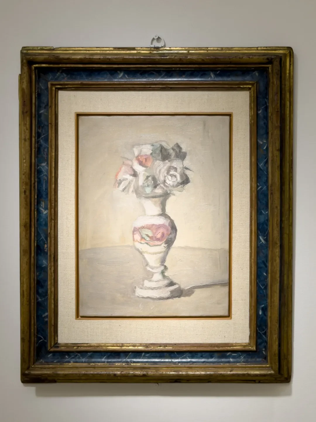
V.n.661, oil on canvas. Museo Morandi, Bologna
Now look back at this flower painting. The bouquet itself has become a cluster, forming together with the porcelain vase below a single vertical form, which is clearly different from the structure of the 1924 painting (the supple scatter of the flowers against the steadiness and containment of the vase). And yet these silk flowers have not entirely become “vase” either. The crown of flowers is still the least stable place in the whole painting. The vase can of course contract and swell, but the crown is made up of many discontinuous composite color patches. White, pink, flesh, gray-blue, and gray-green are laid over one another, and some petals don't even have complete contours. In front of the actual work, it still has that effect: our “knowing” that these are roses comes largely from the overall shape and a few curling dark lines, but if we step closer, it falls back into an assemblage of a few patches of paint.
Another rather interesting thing is the background. There is a boundary where background turns into tabletop, but the difference in color between them is slight. This places it in the same phase as his bottle still lifes of 1948–1949.
Variations
47 & 48.

V.n.788, oil on canvas
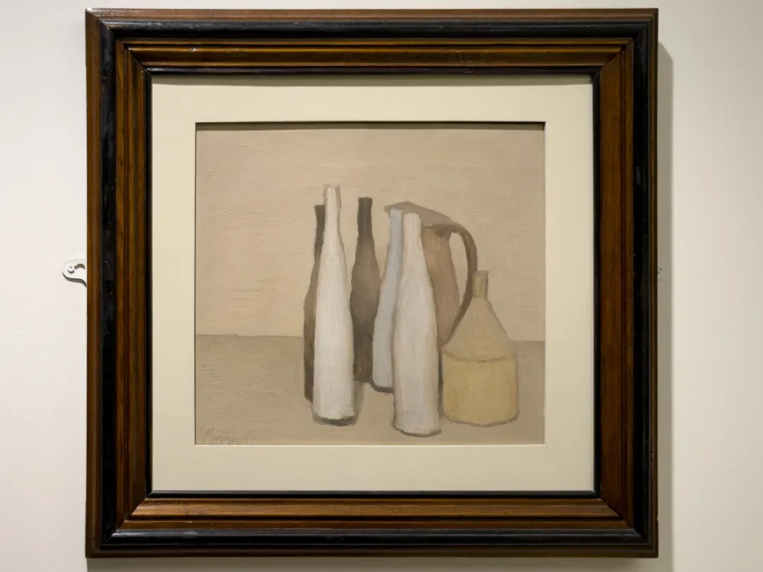
V.n.788, oil on canvas
The first group of works in the exhibition that made me gasp out loud. The objects in the two paintings are the same; the second just adds a long white bottle.
The biggest difference between the two works is this: in the first, the large brown jug in the middle still very much feels like the “subject”; its body, spout, and handle make up a large irregular “mass,” and the long bottles to the left and right surround it. But in the second, the large jug retreats toward the back right, and the long, thin bottles in front begin to have a stronger vertical rhythm, so that the visual impression changes at once from “one large object presiding over the small objects that surround it” to a composite color-field group made up jointly of a number of upright forms.
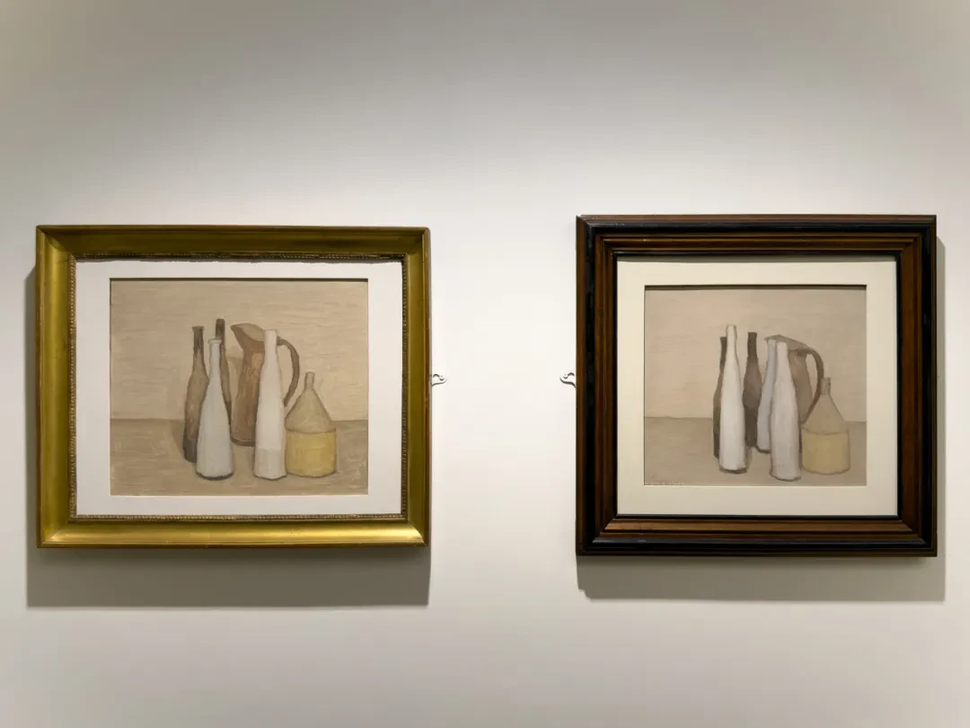
V.n.661 & V.n. 788
What brings about this change is only an extremely small shift (the bottles at the left and right of the foreground have traded places, the whiter bottle has moved back a few centimeters, and a bottle has been added in front of the large jug), yet the overall meaning of the picture is completely altered. This is where what Morandi called variation really does its work. In both works the yellow, nearly funnel-shaped thing on the right is basically stable, and the addition of the long white bottle produces a new alternation of light and dark in the central part. Try listing the colors of the second painting from left to right: dark, white, dark, white, brown, yellow—all of them vertical bands of color—whereas in the first the dark large jug still reads very clearly as a block of color. Adding an object brings not a more crowded structure but a fresh cutting-up of a “mass” that had been too continuous.
49 & 50.
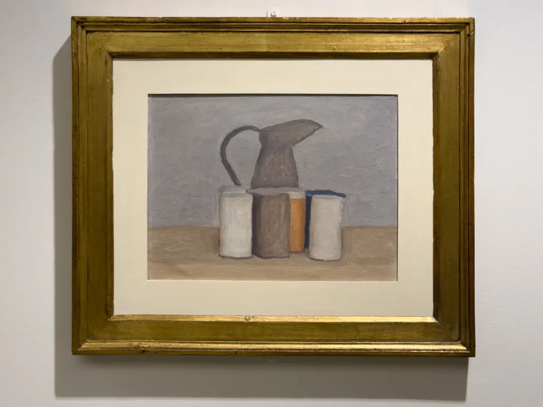
V.n.1197, oil on canvas
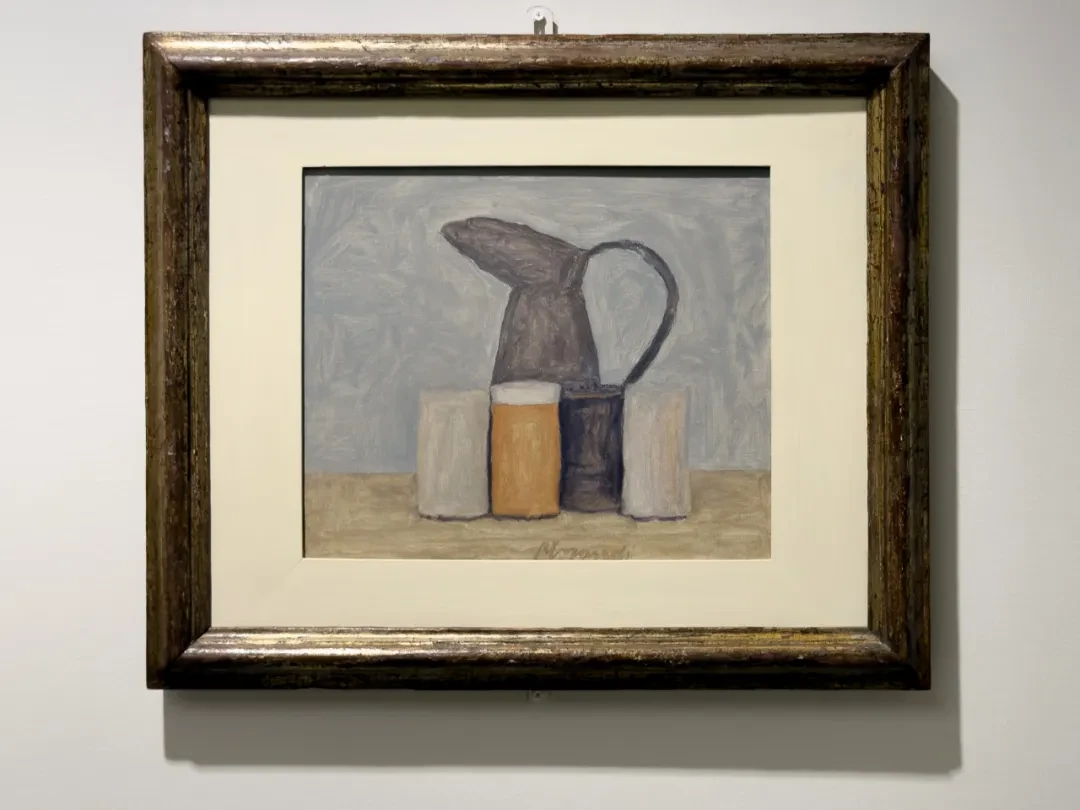
V.n.1225, oil on canvas
This pair is even more brilliant than the last. First look at the first one, V.1997 of 1960. The handle of the large jug forms a black loop to the left, and the spout sticks out to the right. In the second, the jug has been turned around 180 degrees. This turning works together with the jars below to change the visual momentum of the whole picture.
The five jars below are slightly staggered front to back. Pay special attention to the grayish-brown square block that joins the large jug in the picture and is close to it in color, and to the orange square block. In the first painting, the grayish-brown block in the middle is seen from an angle and has an obvious sense of volume, which still lets it be told completely apart from the jug behind it. The orange block is tucked away behind, further deepening the sense of depth and spaciousness in the painting. But in the second, Morandi darkened the grayish-brown block and moved it back, putting the orange block in front of it. Judging from the shape of its top, the block has not been turned to a fully “frontal” position, but because the orange block covers it, it gives us an impression of frontality. More important, this frontalization, brought about by overlap and tiny shifts, lets the little jar now merge more fully, locally, with the large jug above it. The grayish-brown jug above and the dark jar below link up into a vertical axis. So the 1961 composition feels tighter than the earlier one.
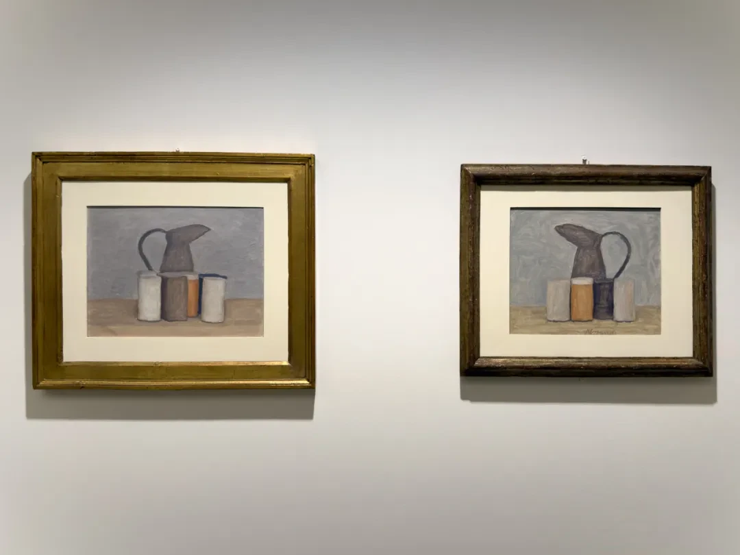
V.n. 1197 & V.n. 1225, oil on canvas. Museo Morandi, Bologna
Ten years on, “variation” itself has changed. In the 1951 pair, variation still plainly happens within a complex group of objects, but in this 1961 one the variables have been reduced further still: just by turning the jug around and switching the positions of a few composite color blocks, the picture produces a completely different impression. Repetition at this point comes closer and closer to a perceptual experiment. The more familiar the object, the less it can draw us by its own novelty, and only then can our attention shift to what usually gets overlooked.
The Yellow Drapery of 1952
51 & 52.
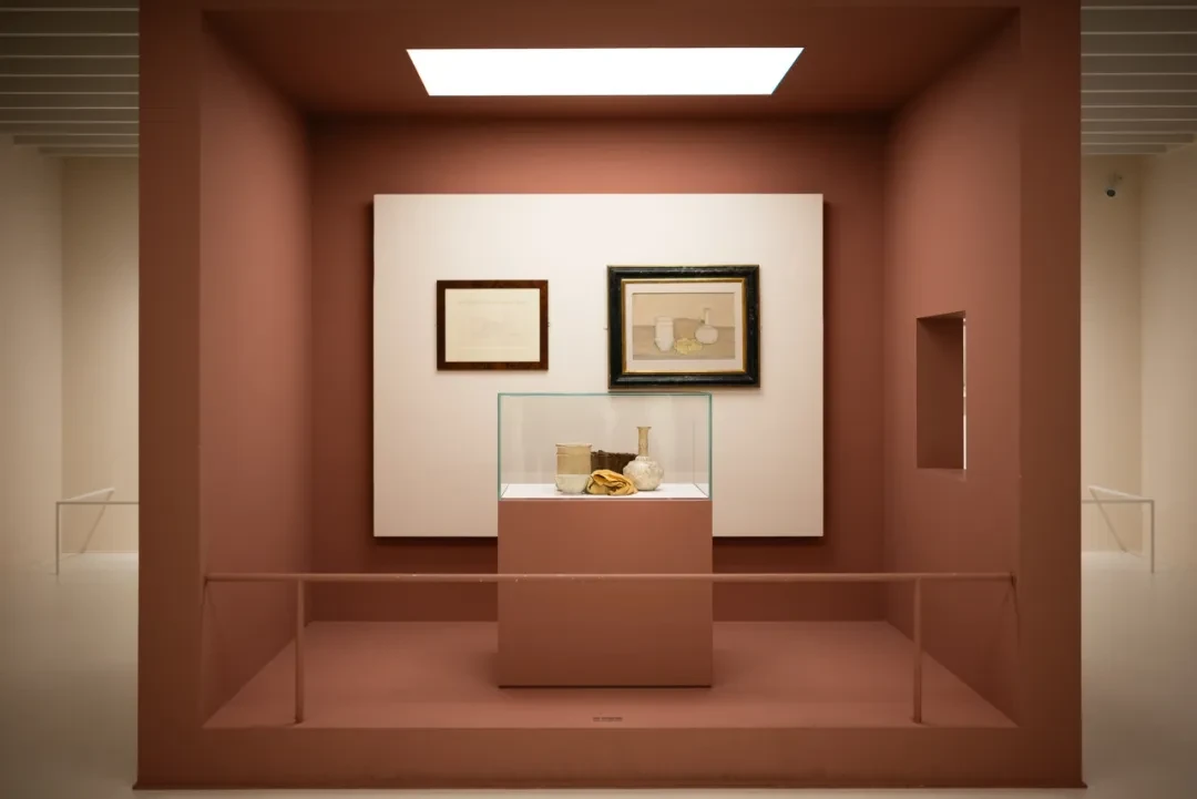
V.n.823, oil on canvas. Museo Morandi, Bologna
Photo by Hong Xiaoyu
The gallery included the actual objects and the drawing alongside the painting. Unfortunately, because the objects were in front and in the way, the painting was really too far away from me.
The label clearly identified five things: a white cylindrical bottle, a wicker basket, a white bottle, a ceramic bowl, and a yellow silk drape.
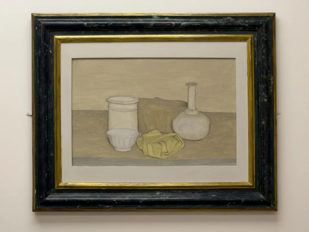
V.n.823, oil on canvas. Museo Morandi, Bologna
Most obvious is the basket at the back. The real basket has a strong wicker texture, and that texture draws the eye. But in the painting the texture has vanished completely; the basket has become a slightly irregular mass. Its job in the painting is to connect the white cylindrical bottle on the left with the round-bellied white bottle on the right. Both white objects are quite definitely vertical, and if there were nothing between them, the picture would break into two isolated islands, left and right. This low brownish-ochre form lies across the back like a bridge. But it is itself partly hidden by the yellow cloth in the foreground, so it does the work both of connecting and of receding.
Now look at the white cylindrical bottle on the left. The real thing is ceramic, with an obvious rim, wall, and base, but in the painting Morandi made it very close to a soft cylinder. Its white especially, you can see, is mixed with a lot of grayish yellow and off-white, so it doesn't produce the strong contrast of a pure white object jumping out from the background; instead it gives the cylinder an airy transparency. The round-bellied, long-necked bottle on the right is the same: the surface decoration and details of the real object have largely been deleted, leaving only the most basic proportional relation of round belly to slender neck.
With this in mind, the yellow cloth in the middle becomes even more interesting. Morandi usually likes best the hard objects that can keep a stable geometric contour, whereas cloth is soft and has no fixed form, so you can fold it or roll it up and give it some temporary shape. In this painting, though, the cloth has become like a stone, and its folds are painted as a few definite facets. Nor does the cloth have the drooping posture of the 1924 paintings; instead it curls inward and contracts, becoming even more solid.
The cloth sits right near the central axis of the composition. The bowl and the cylindrical bottle on the left form one group, the round-bellied bottle on the right another, the basket at the back joins the two sides horizontally, and the yellow cloth juts forward from the center. So the whole painting has a not-very-obvious cross structure. Only, Morandi compresses the longitudinal axis (the axis of depth) until it is very faint.
Now look at the bowl in the lower left. Its importance only becomes apparent on close inspection. It sits right up against the front of the cylindrical bottle. Their hues are far closer in the painting than in the real objects, so they are easily seen as a single whole, especially if you are nearsighted and looking from a distance. But its notched rim and vertical ribs keep breaking that whole apart. The bowl is also the lowest form in the whole group, so that from the tall cylinder on the left down to the bowl in front, then rightward across the low yellow cloth, and finally up to the round-bellied bottle, the whole arrangement actually has a very slow rhythm of high and low. If you trace its outer contour, this becomes even more obvious.
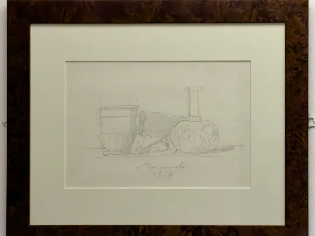
Then take a look at this 1952 drawing. The cylinder, basket, white bottle, bowl, and cloth are already quite definite in the drawing. In the finished painting we can see that the viewpoint is actually slightly higher than the objects, whereas in this drawing the viewpoint is still level with them. That little bit of extra height is very interesting. Any higher and it easily becomes a bird's-eye view; any lower and the yellow cloth can no longer be made out.
There is another special thing here: the narrow blue-gray band at the very front edge of the table. It forms a horizontal boundary with the brownish-gray tabletop above, so we know the table has thickness. But it is only a band of color; it has not become a deep, heavy shadow.
Look back at the lighting of the whole painting. We find that the light is diffuse, and the shadows of the objects appear almost only as they cling to their edges. These objects undoubtedly have volume, but the light does not emphasize this through dramatic cast shadows. Why is the white bottle round? We perceive it through the contour and an extremely faint gradation inside. Why does the yellow cloth have facets? Again, we perceive it mainly through a few composite-color boundaries. And yet between the objects and their surroundings there remains a slight looseness, as though these objects were floating on top of the background.
By the still lifes after this I was really too worn out to look. On site I basically skimmed past them. So I'm skipping the analysis too. I have to admit that looking at paintings like these takes far more mental and intellectual effort than looking at ordinary paintings. But it seems that without that effort there is no way into Morandi. If I get the chance, I may go back and look at them carefully. Below is the last work in the exhibition.
Nothing Is More Abstract than Reality
53.
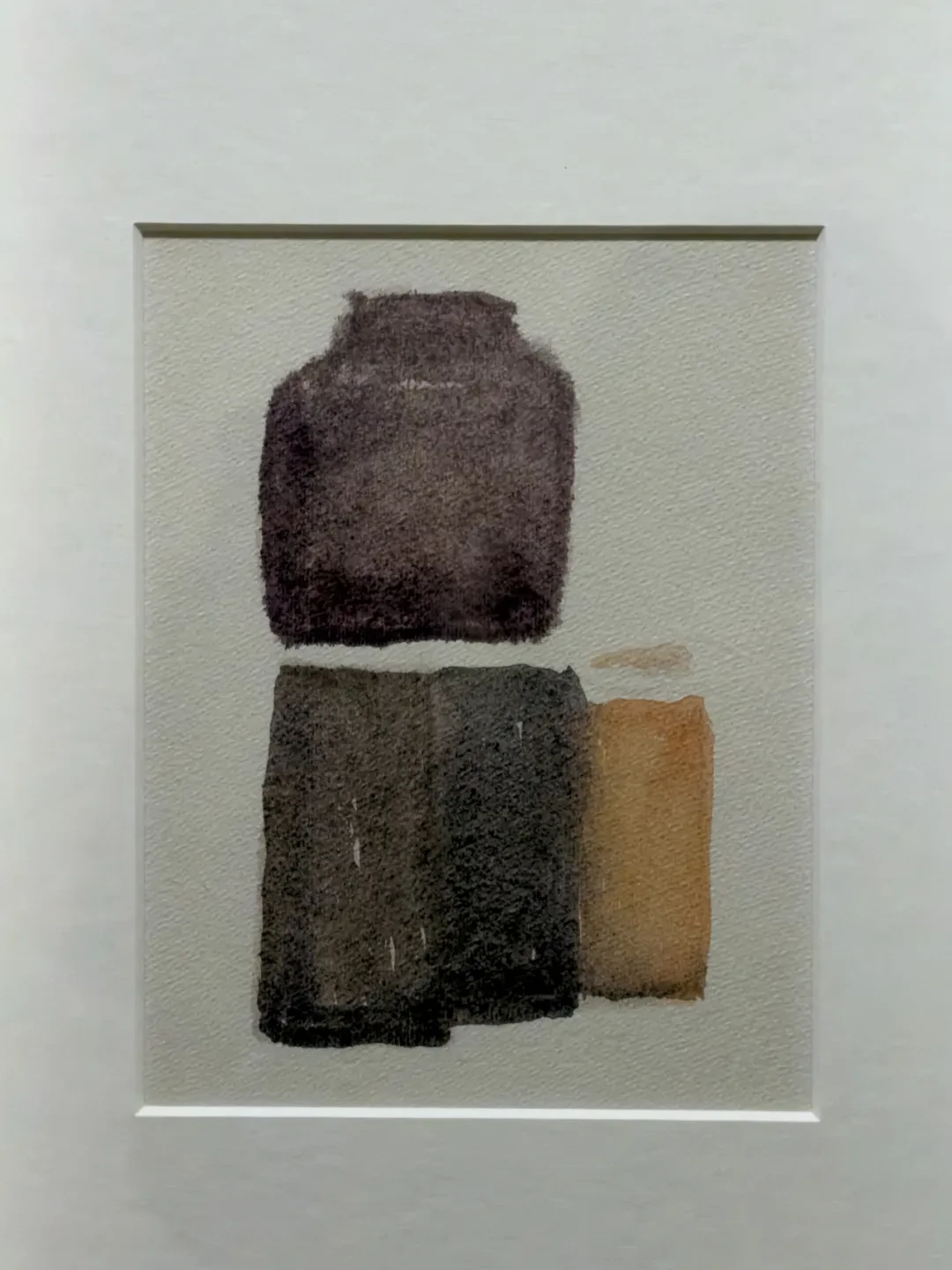
Watercolor on paper, 20.5 × 16 cm. Fondazione Magnani-Rocca
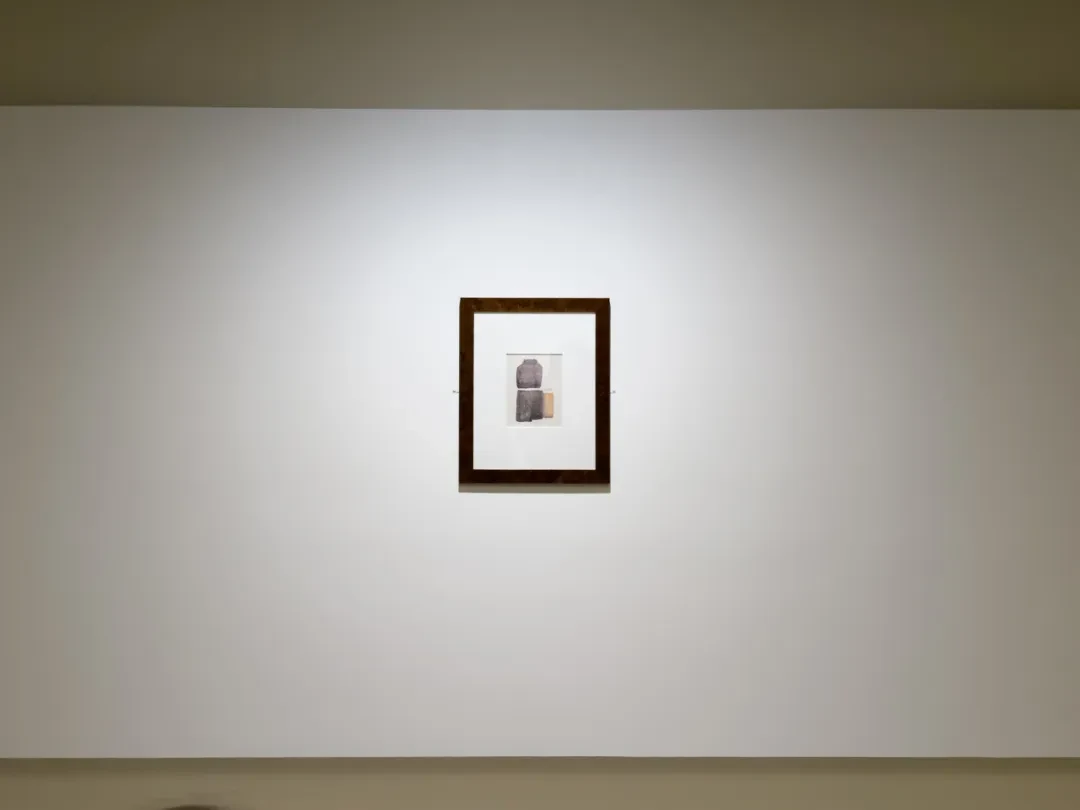
This is one of the most important group of works from the last stage of Morandi's life. It is a watercolor, tiny in size, but hung alone on an entire large wall.
Don't think yet about what these objects are. I think we can start from here: where has the “tabletop” of this still life gone? However much the earlier Morandi compressed space, there was always a dividing line in the background indicating three-dimensional space. But this picture has nothing of the kind. So the objects have no definite spatial footing; they simply appear on the paper. The dark purple-brown thing above, you can tell, has a belly and a short neck, so it is still fairly close to a container. But what are those lumps below? The dark grayish-brown form toward the left is just a four-sided patch of color, and the ochre-orange on the right just a vertical band.
The work is extremely small, only 20.5 × 16 cm, but it is placed all by itself in the middle of a big wall. Seen from a distance, it is three faint patches of color swallowed up by a vast amount of white wall. As you walk closer, you slowly begin to make out the bottles.
The crucial thing is this: even so, the painting does not become completely abstract. Morandi compresses the information that lets us identify the objects to the barest minimum, because if the purple-brown form above were a bit vaguer—suppose the curve of the shoulder and the short horizontal edge at the top were both changed—we would have no reason at all to call it a “jar” anymore. The ochre-orange patch in the lower right, if it did not keep that relation of scale with the dark patch beside it, would be nothing but a rectangle. But precisely because of this, we can “call” the patches below jars too.
V.n.823, oil on canvas. Museo Morandi, Bologna
The purple jar above does not actually touch the brown block below, and the gap is nothing but a strip of bare white paper. The whole sheet is now cut up by these few patches of color, and the paper white showing through is at once the spacing between objects and, at the material level, spacing on the sheet of paper. The purple-brown inside the shape at the upper left is not uniform either; within it there are many extremely fine variations of depth, and its edges have a fuzzy look where the color seeps into the grain of the paper.
What is rather interesting is the small, isolated stroke of ochre on the right. It hangs above the large ochre form without fully joining it below. So the nature of this stroke is actually hard to determine. This stroke of color can belong at once to pre-Greenbergian representation and to the Greenbergian materiality of the paper surface itself.
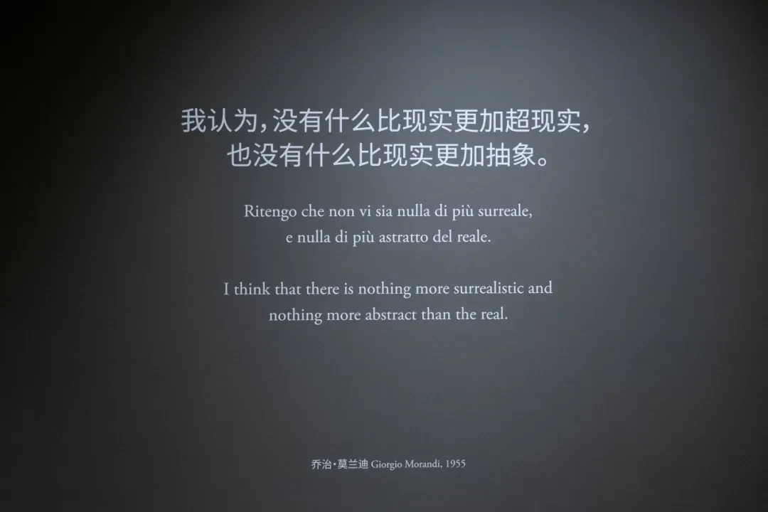
To come back to that line on the wall beside it, “nothing is more abstract than reality”: it is really an epistemological problem, one we have touched on again and again: a bottle is not naturally a clear “bottle,” because the very process of recognizing a “bottle” is already mixed up with our concepts, our language, our memories, our habits; once we keep looking for a long time, what is really given first in our consciousness is those colors, those relations of overlap, and so on. In this watercolor, we know it is a still life, so we keep wanting to see the patches below as “objects,” but what our perception actually takes in is just a few very unstable composite color patches on white paper. Imagine someone who has never heard of Morandi and has never seen a Morandi painting: what kind of “recognition” would they arrive at, looking at this picture? How long would it take them to see that these are bottles and jars?